A multi-specialty health platform built so the patient stops being the integration layer: one record that carries a prescription to the pharmacy, a test order to the lab, and the result back to the doctor who asked for it. Patient, clinician and operations are three surfaces over one token system, and the safety rules constrain the interface rather than decorate it. You can open it and use it on this page.
A design prototype on fictional data. Not a medical device, and not a source of clinical advice.
The real prototype, not a recording. It starts where a real user would: a splash, three intro cards, then a passwordless sign in. There is no password to type and the six-digit code is already filled, so you can walk the whole way in or skip ahead. Runs entirely in your browser.The real prototype runs in your browser, but it needs a wider screen than this to be usable in-page.
Open the demo ↗In a multi-specialty hospital, the patient is the integration layer. They carry a paper prescription to the pharmacy, a paper requisition to the lab, and a printed report back to the doctor who ordered it. Every handoff is a place the system quietly asks the patient to do its job.
Launch it and you start where a real user starts: a splash, three cards explaining what the thing is for, then a sign in with no password in it. Onboarding asks who you are, what a doctor should know, who to call in an emergency, and who else you look after. That last question is the one that matters, because it is where a health app stops modelling one patient and starts modelling a household.
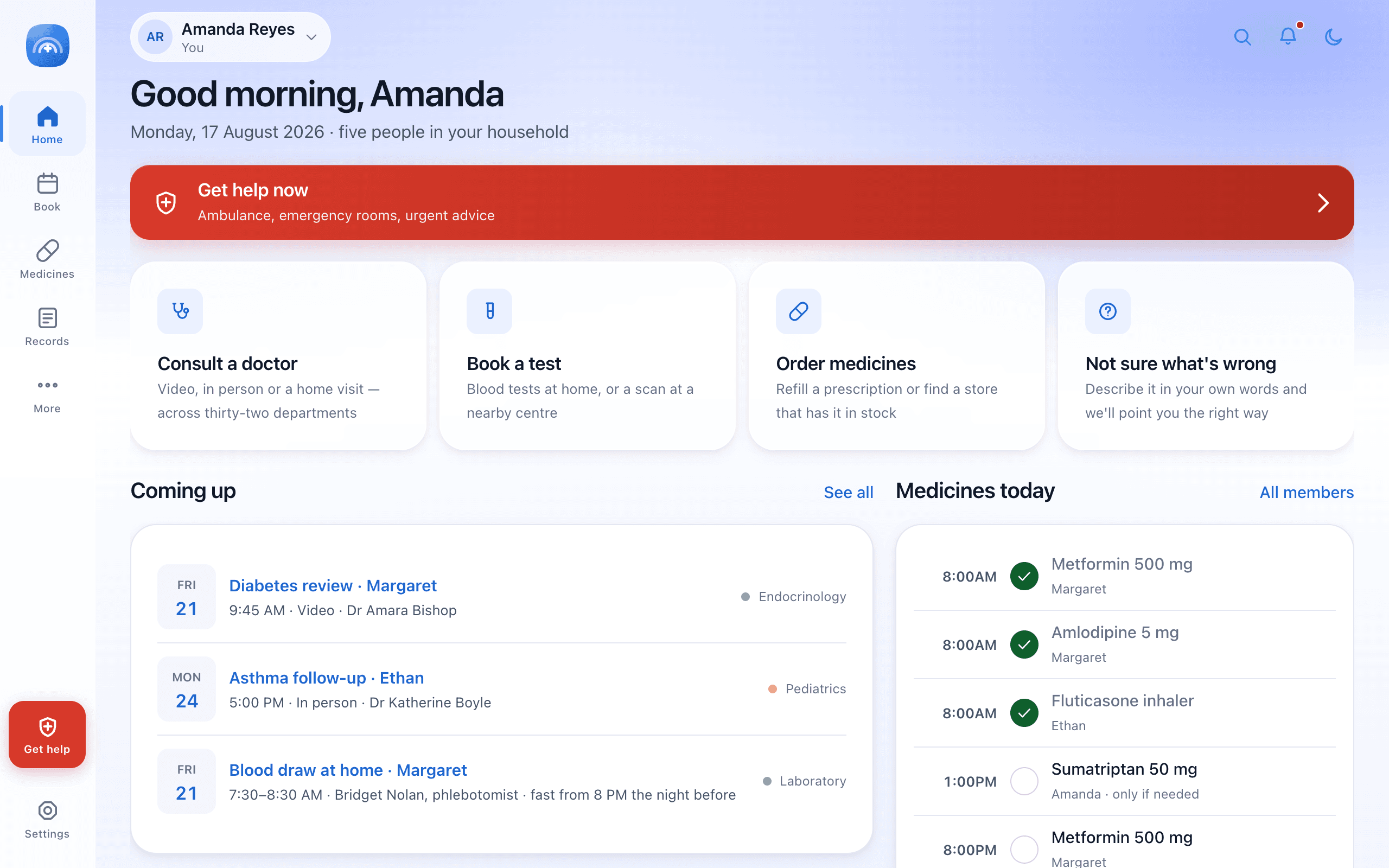
Come out the other side and you are on Amanda's home screen on a Monday morning. She looks after five people, so the first thing the product has to get right is whose day this is: the medicines list runs across three different people before you have scrolled once.
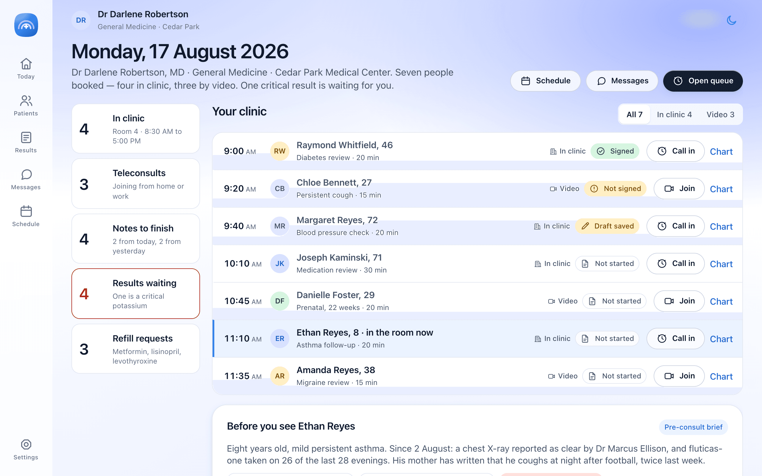
Four surfaces sit in the window chrome. Patient is the app itself. Clinician is the same Monday from Dr Robertson's side: seven people booked, four notes unfinished, and one critical potassium waiting. Operations is the desk that runs the building, with 84 appointments, a bed board and a pharmacy verification queue. Design system is Aurora, the token layer all three are built from.
The specification this came from opens by listing eight ways multi-specialty care fails people. None of them are dramatic, and none of them are anybody's fault. They are the ordinary seams between departments that were each built correctly on their own terms.
Eight failures, all of them ordinary, none of them anybody's fault.
Discovery is guesswork. Prescriptions are unreadable to the person holding them. Reports arrive as a text-message link that expires. Families are invisible to a system that models one patient at a time. Every one of those is a handoff where the record stops and a human being is asked to carry it the rest of the way.
A person with abdominal pain does not know whether they need Gastroenterology, General Medicine or Emergency. Presenting them with an alphabetical list of 32 departments is not help, it is a quiz they did not study for.
So the entry point is plain language. Describe it in your own words, or point at a body map instead. Then at most four questions, every one of them skippable, with a standing offer to stop and just book a general appointment. What comes back is a proposal with its reasoning attached, not a verdict.

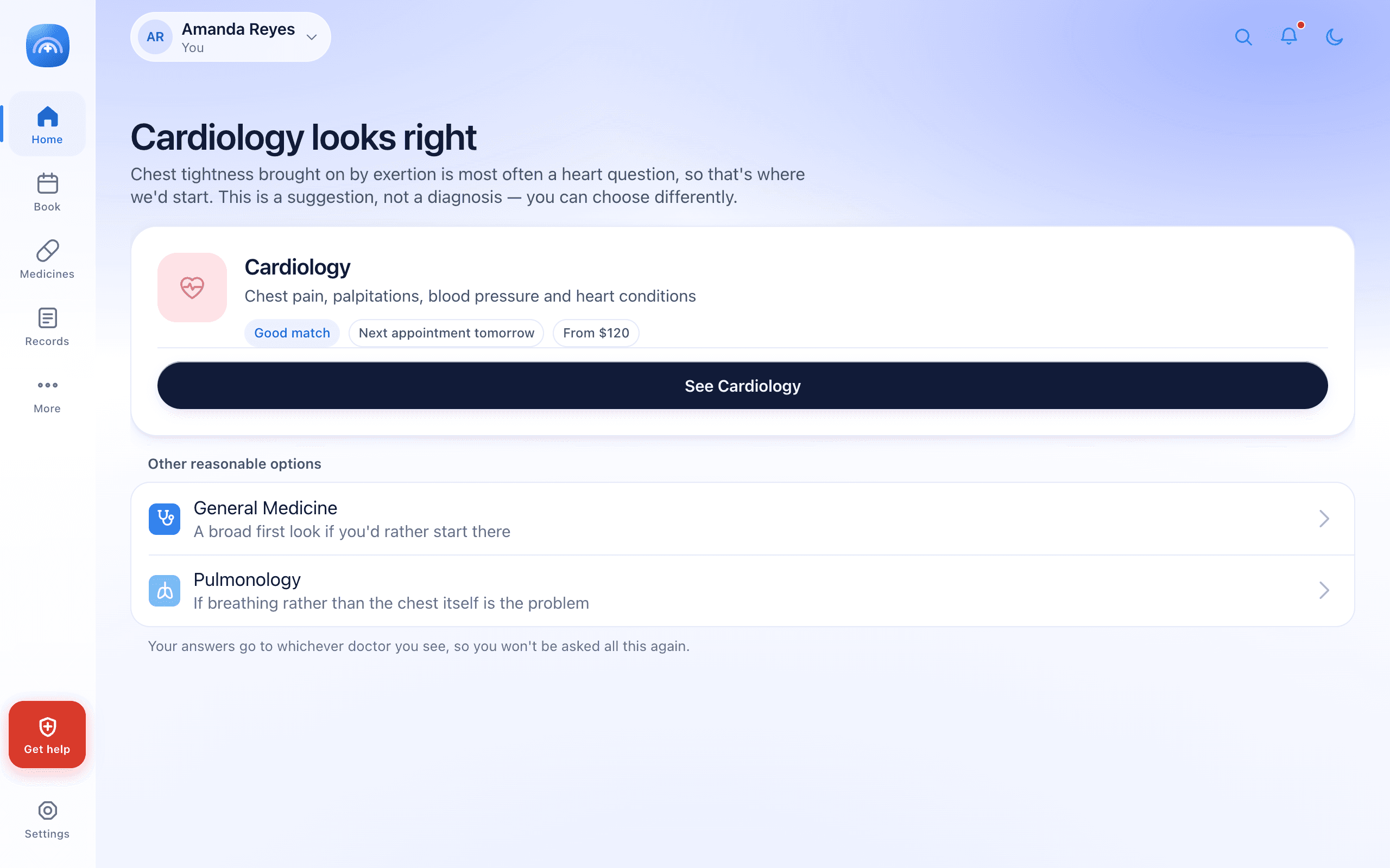
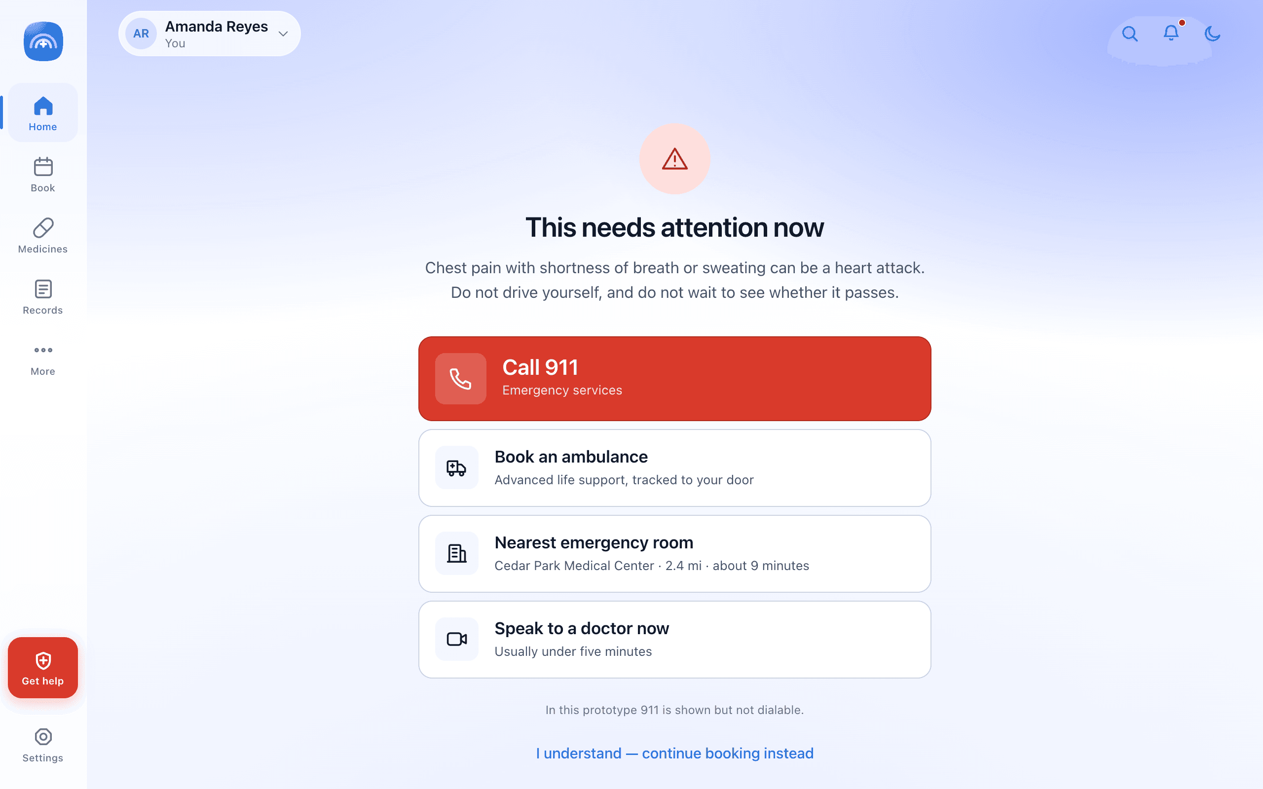
Underneath every lane runs a red-flag check. Describe chest tightness with exertion and you get Cardiology. Add shortness of breath or sweating and the routing is overridden entirely: the flow stops and hands you emergency options before anything else can happen.

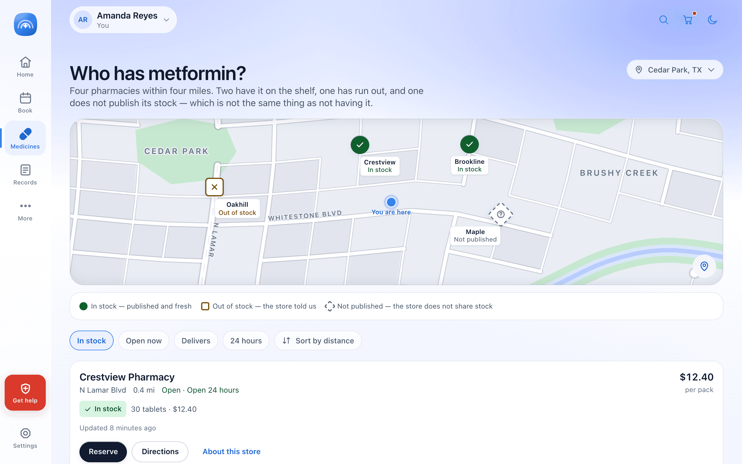
The argument for one record is easiest to see by watching a single thing cross the boundary. A prescription written in a consult becomes fillable in two taps. An ordered test becomes a booking, with a phlebotomist and a collection window. The result returns to the doctor who asked for it, rather than to a portal the patient has to think to check.

The clinician surface is where the record has to earn its keep. A pre-consult brief assembles what is already known about the next patient before the door opens, and the critical potassium at the top of the queue carries the time it was released and the reference range it fell outside. Neither of those is new information. Both are usually somewhere else.
My favourite detail is in the prescribing form, where the dosage instruction is typed out as a sentence rather than assembled from codes. The field help underneath explains why: the patient reads exactly this, and so does the pharmacist. One string, written once, with no translation step between the person who meant it and the two people who have to act on it.

Most of the interesting decisions here are refusals. In a product where colour and language carry clinical weight, the design system is most useful when it forbids things.
Red is never a trend
A worsening value renders in calm azure whether it rose or fell. Coral is reserved for the emergency button, the critical-value card and the delete confirmation, and appears nowhere else on a patient surface. If red meant "worse", every routine fluctuation would read as an alarm and the real alarm would stop working.
A notification never names your condition
Lock-screen copy says only that something is waiting: a report is ready, an evening dose is due. It does not name the condition, the result or the department. The notification is read by whoever is holding the phone, which is not always the patient.
Colour is never the only carrier
The 14 categorical department tokens were chosen for hue and lightness separation, so pairs stay distinguishable under deuteranopia and protanopia and survive being printed in grayscale. Department colour is identity and wayfinding only, never clinical status, and always sits next to a text label.
No photograph is attached to a person
Patients and clinicians get generated initials on a deterministic tint. There is photography in the product, but every image of it sits in the onboarding screens, where it is selling the idea of care. Not one of them appears next to a record.
Numbers get the same treatment. Every result, dose, vital and price is set in tabular figures with a slashed zero, which is the difference between reading a dose and guessing at one.
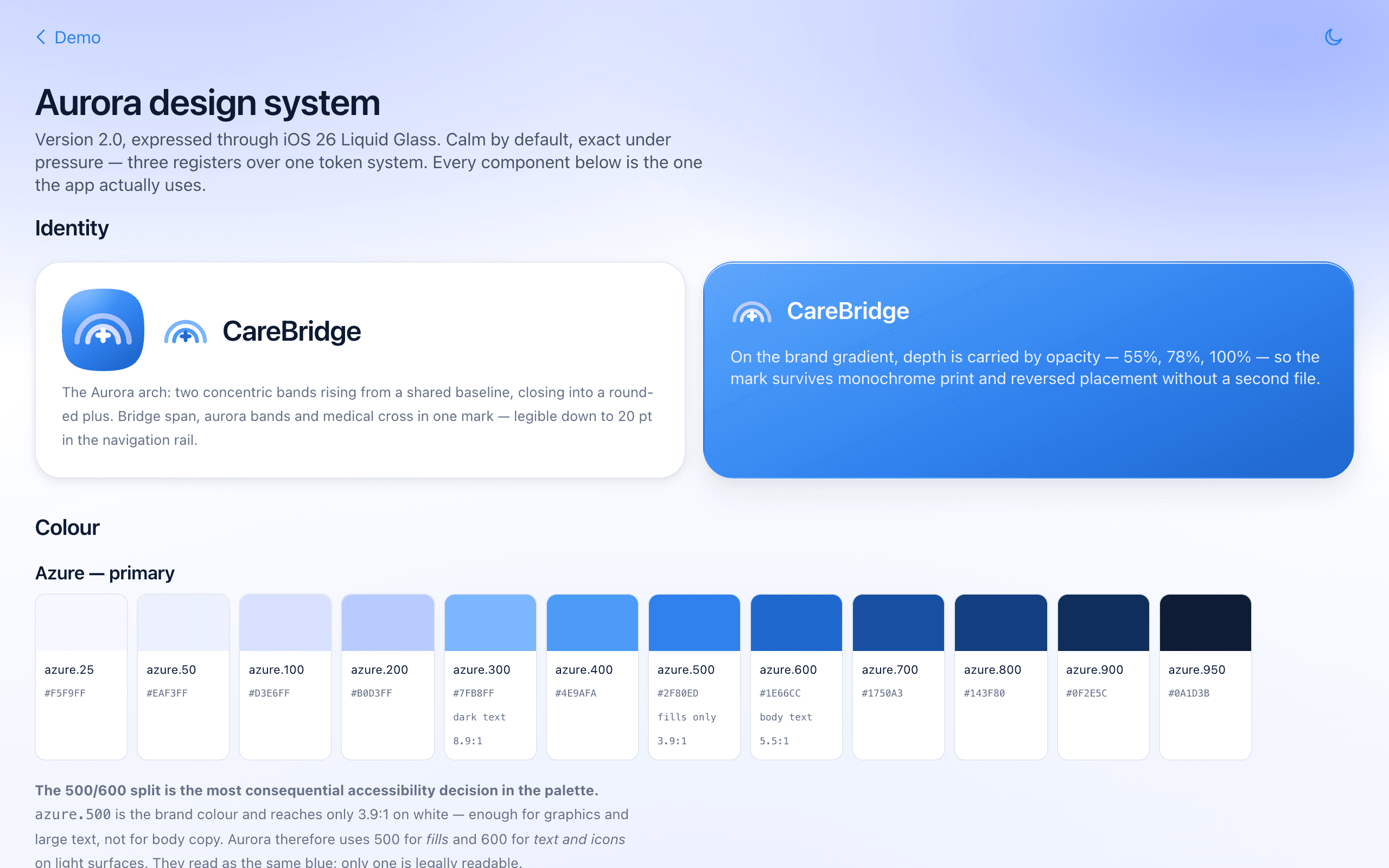
Aurora is the token layer underneath all three surfaces, expressed through iOS 26 Liquid Glass. Its brief is "calm by default, exact under pressure", which in practice means the visual system has to get quieter exactly where the stakes rise.

The most consequential decision in the palette is a split most people would never notice. azure.500 is the brand colour and reaches 3.9:1 on white, which is enough for fills and large text and not enough for body copy. So azure.600 carries text and icons on light surfaces at 5.5:1. They look like the same blue. Only one of them is readable, and the system refuses to let the pretty one do the reading.
The glass has a rule too: any surface carrying body text, a form control, a data table or a clinical value drops to the least transparent material or goes fully solid. Translucency is allowed to be decorative right up until the moment something has to be read correctly.
There is no device picker. The app measures its own environment and lays itself out accordingly: a fixed 88px rail with a twelve-column field on a desktop, an eight-column layout with a floating tab bar on a tablet, and a single column on a phone.