Praduan Saha
Loading work
Seventeen 1:1 graphics built on one editorial system: a ten-part carousel arguing studio design against corporate design, two field-note posters on where the craft is going, and a bilingual Durga Pujo and monsoon campaign for a Kolkata home salon. One square, a few seconds, and no second chance to explain.
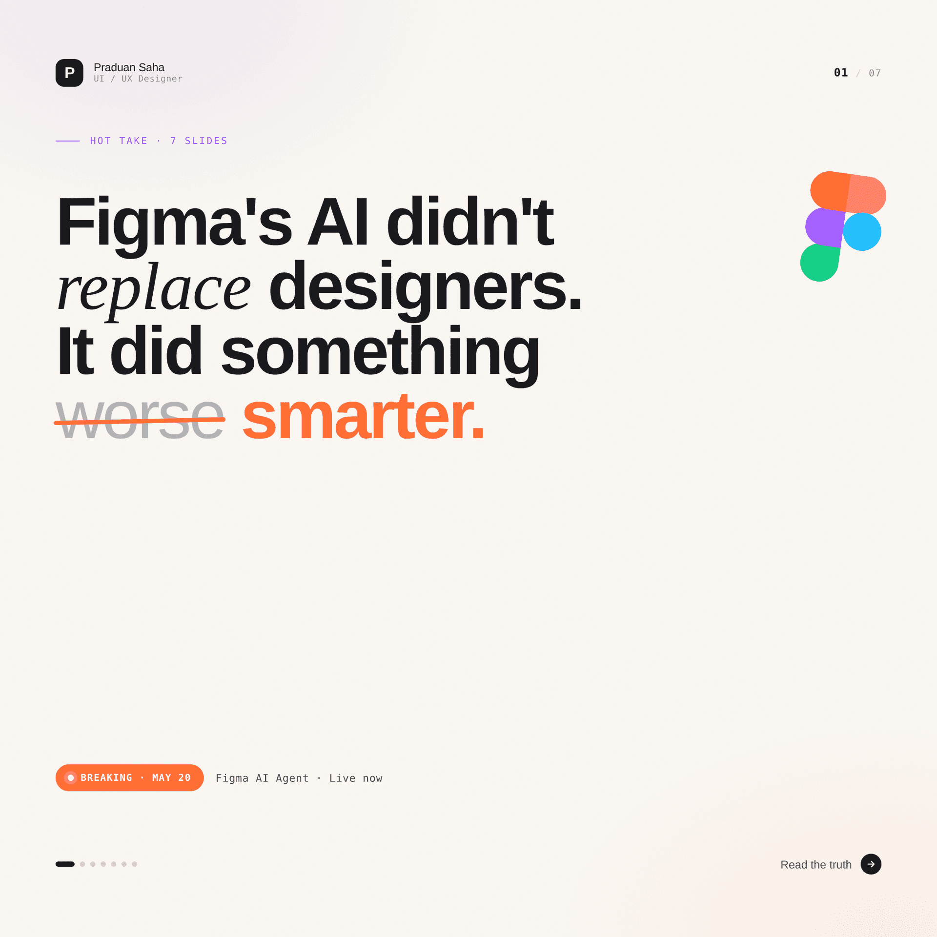
A feed gives a graphic about one second to earn the second one. Seventeen squares, three strands, and a single editorial system underneath — built so the argument survives at 200 pixels.
This is the only body of work on this site with no interface in it. No flows, no states, no empty screens — just seventeen 1:1 graphics that have to land an argument in a scrolling feed and then get out of the way.
Three strands, made over 2025–2026: a ten-part carousel on the pull between studio and corporate design, two field-note posters on where experience design is heading, and a bilingual festival and monsoon campaign for Glow by Rachel, a home salon in Kolkata. The first two are self-directed. The third is client work with live prices, live dates and a live phone number on it.
They look like three different designers made them. That is the point, and it is the hardest thing here to get right.
A square in a feed is not a canvas. It is a headline with a picture attached.
Everything about this format is hostile to design. The canvas is 1:1, so there is no reading direction to exploit. It is seen at roughly 200px before anyone decides whether to stop, so anything under about 28px of type is decoration. It arrives with no context, so it cannot assume the previous slide was read. And it competes with everything else in the feed, so the first beat has to be the argument, not a warm-up.
The response was to stop treating each post as a poster and start treating the set as a publication.
Every self-directed piece runs the same furniture, in the same places, so a reader who has seen one can navigate any of them without looking:
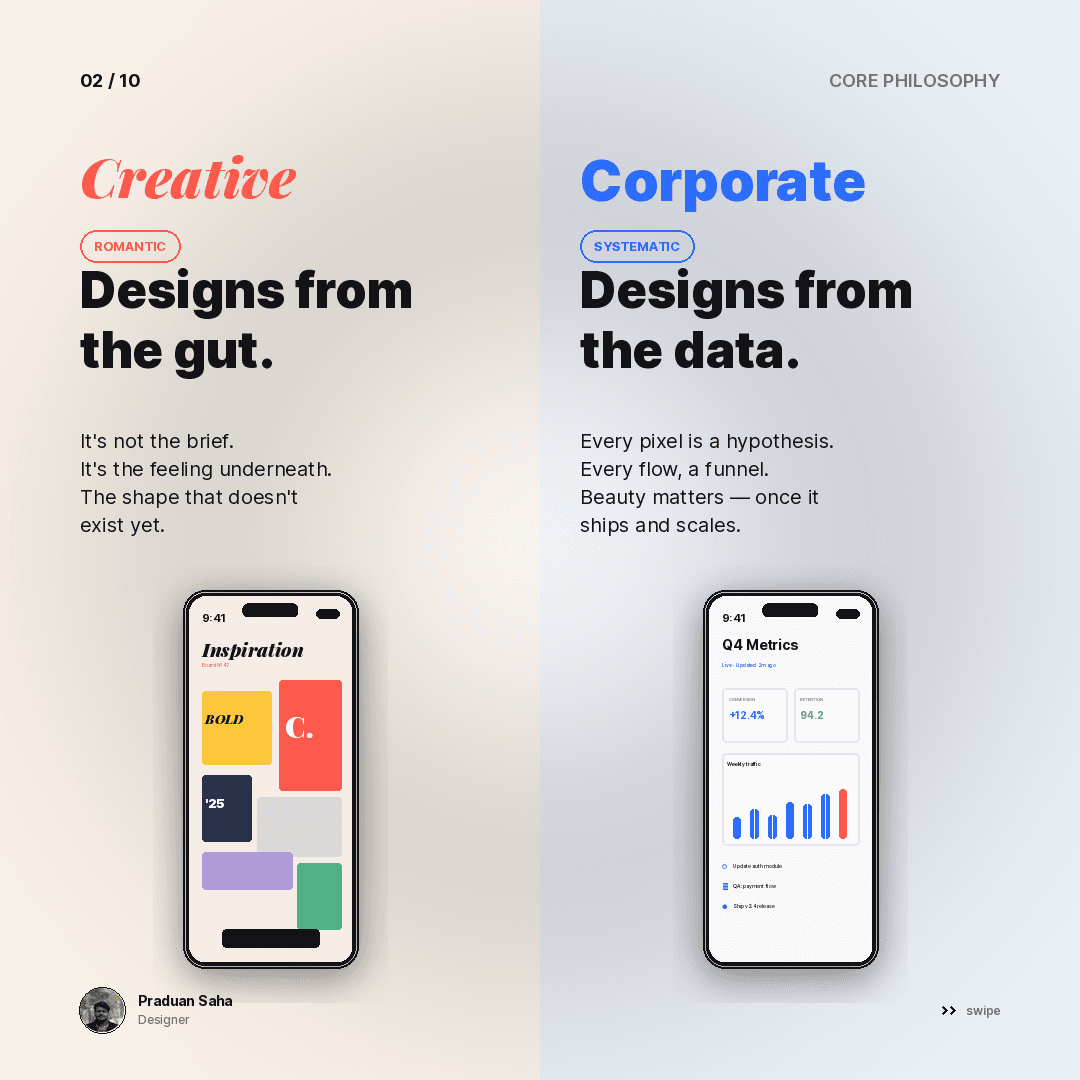
03 / 10) in the top corners. It never moves, so the eye stops looking for it.CORE PHILOSOPHY, THE WORKSPACE, CONSTRAINTS, STAKEHOLDERS. Every slide announces what kind of argument it is before making it.That furniture is why ten slides read as one document instead of ten posts. It is a design system; it just happens to compile to PNG.
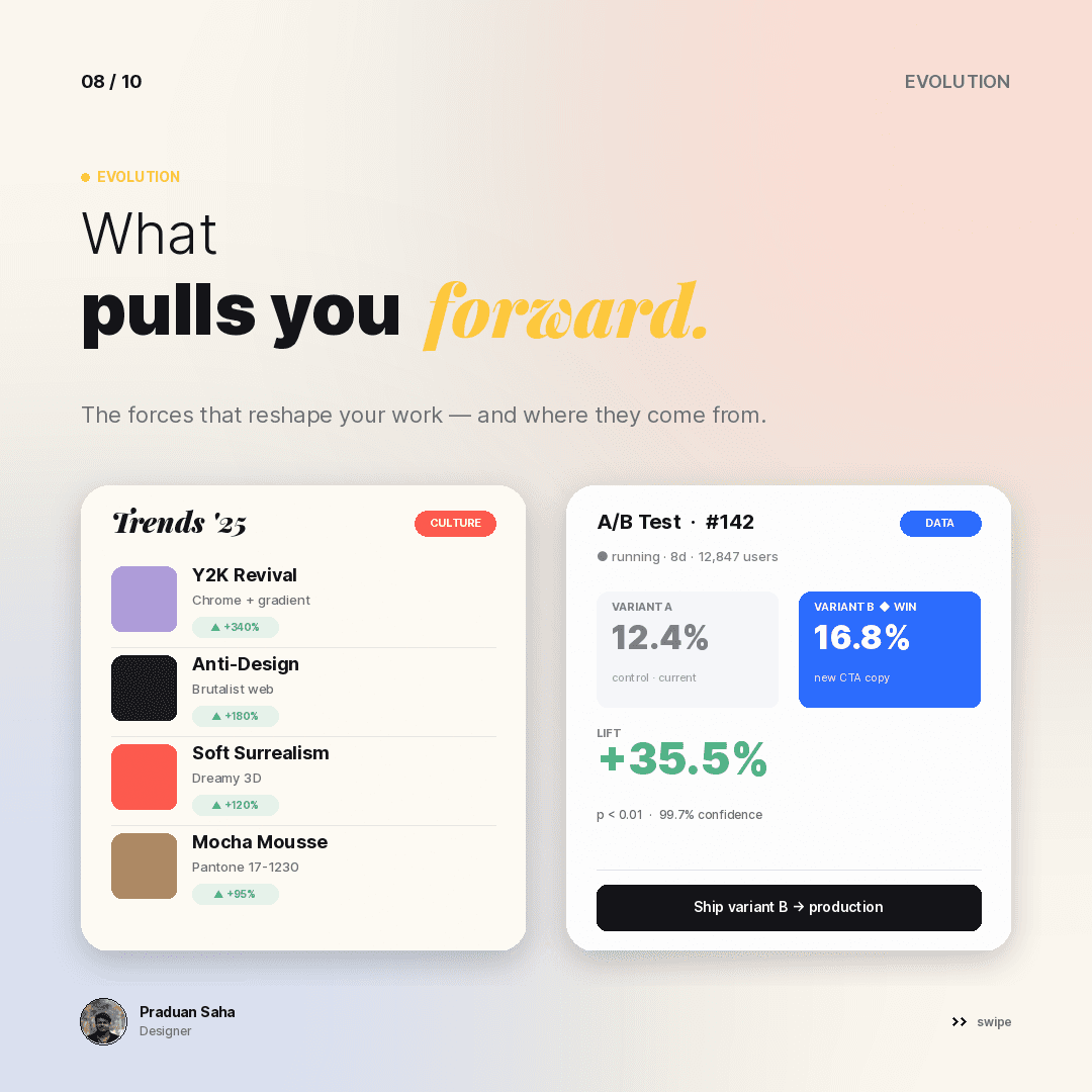
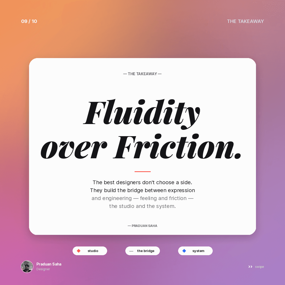
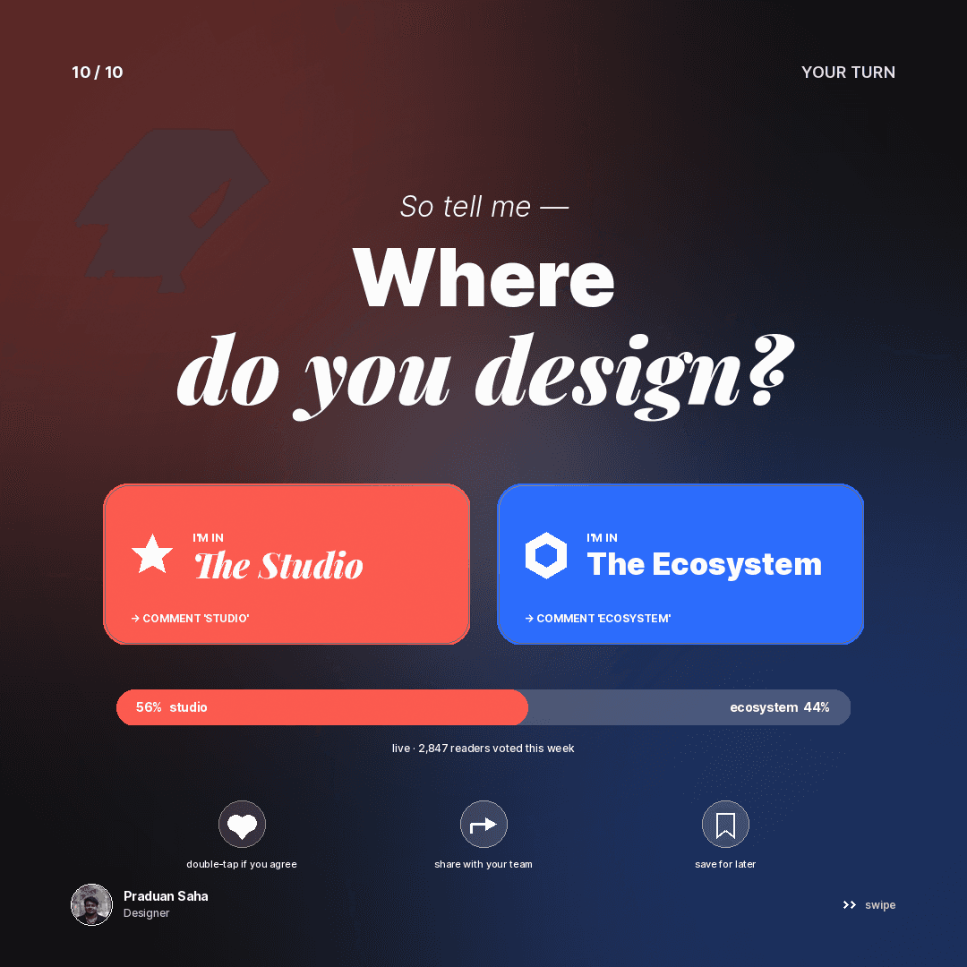
Ten slides on a question with no correct answer: does design belong to the studio or the ecosystem? Each slide takes one axis and refuses to resolve it — philosophy, workspace, how a win is counted, constraints, who is in the room, what pulls the work forward — and the deck closes by handing the question back.
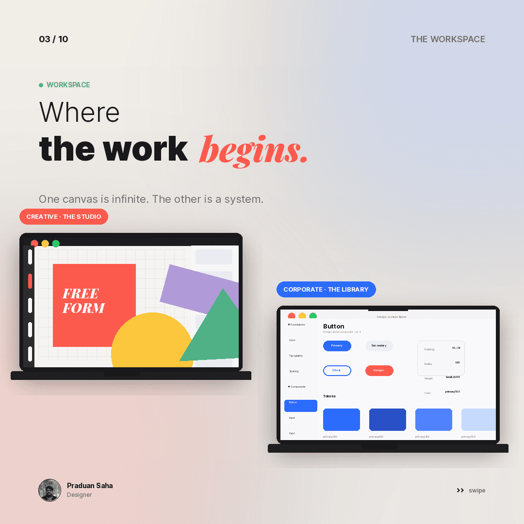
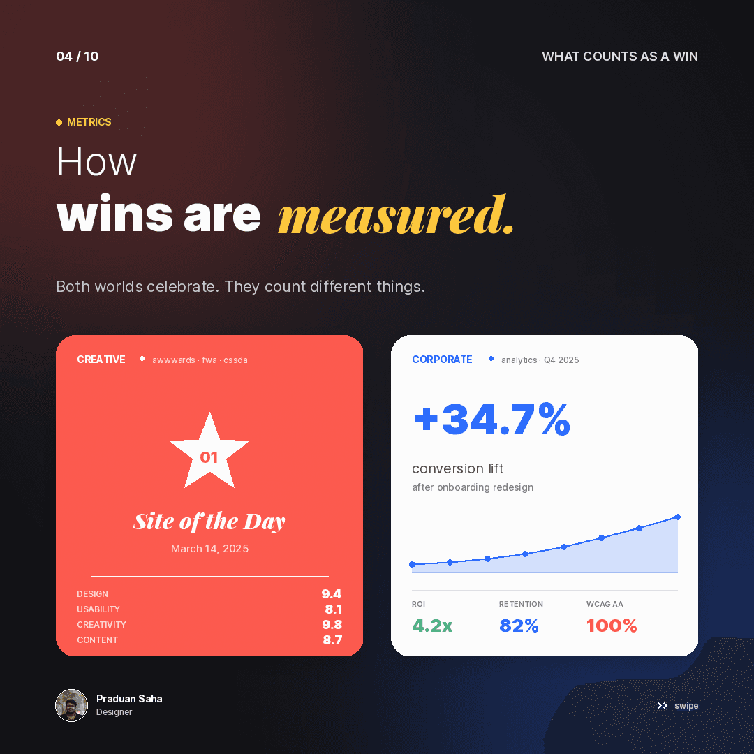
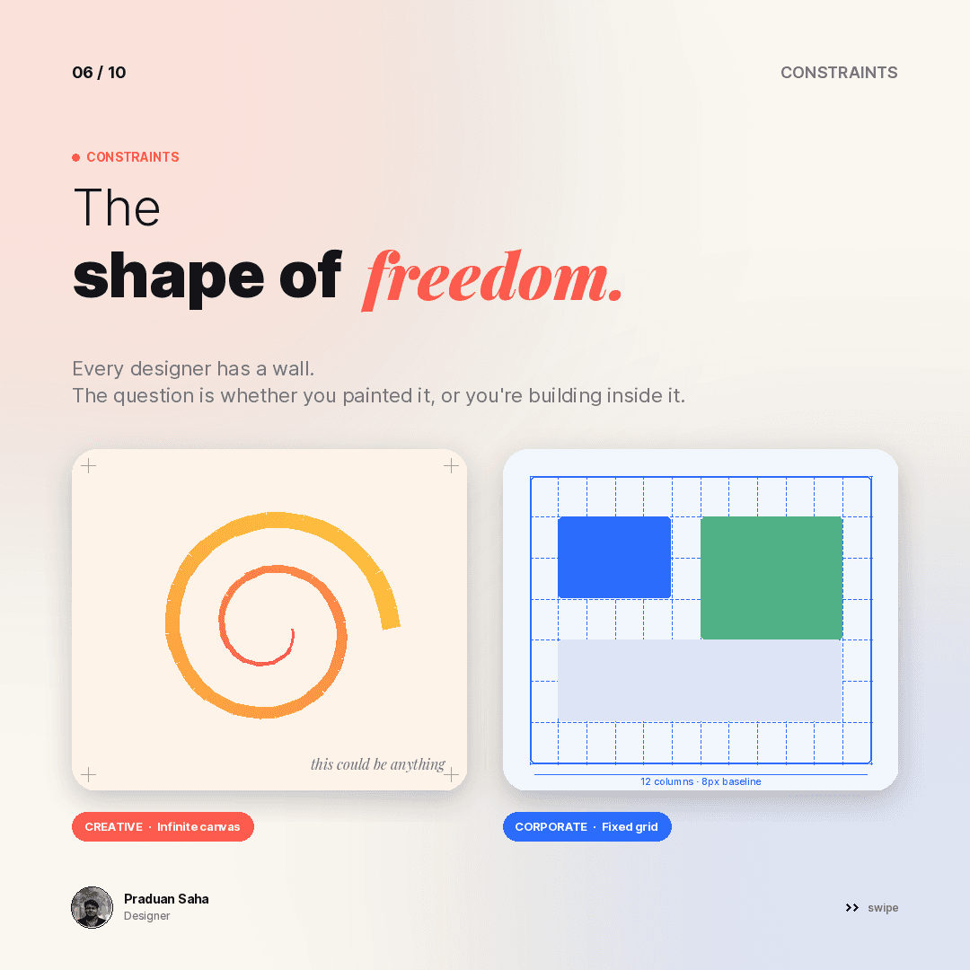
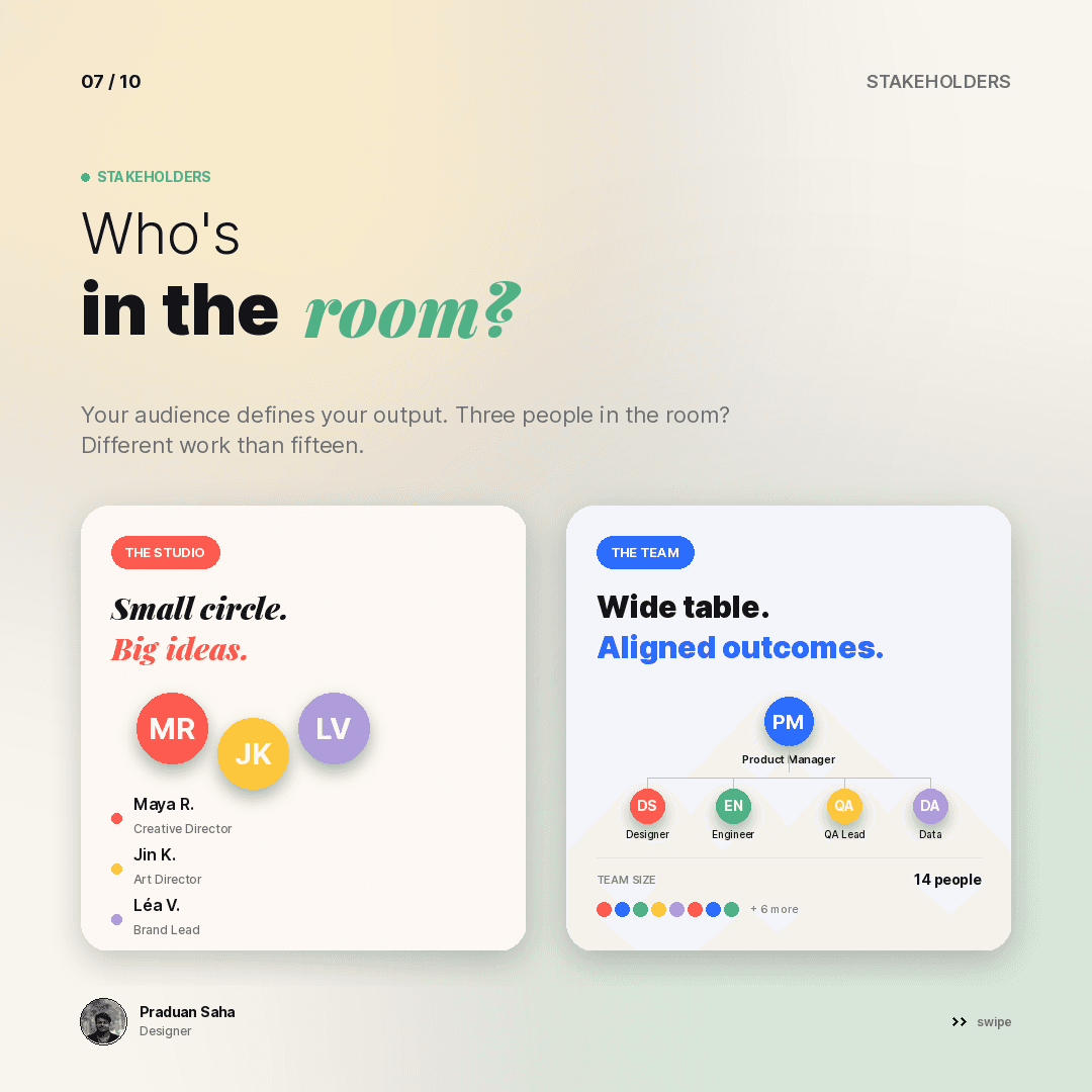
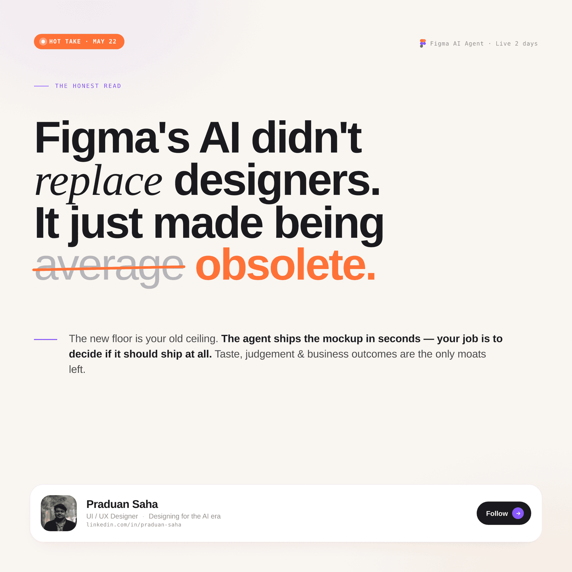
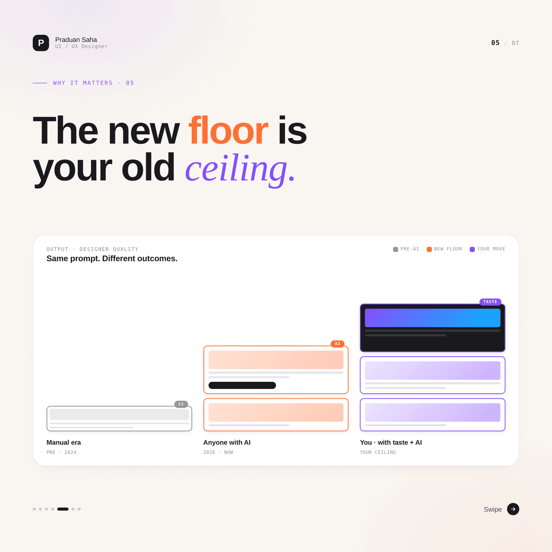
Two standalone posters, set as a printed page rather than a slide: a masthead, a volume number, a rule, and a six-cell grid of ideas that each get a heading and three lines. They are the densest things in the set and the ones that most needed the type hierarchy to hold.
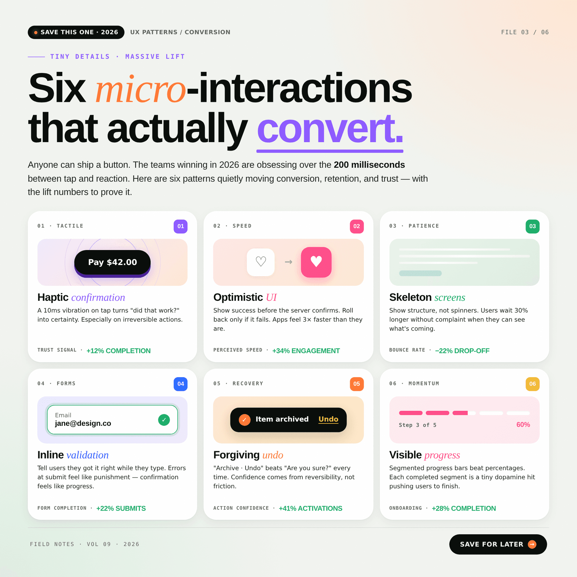
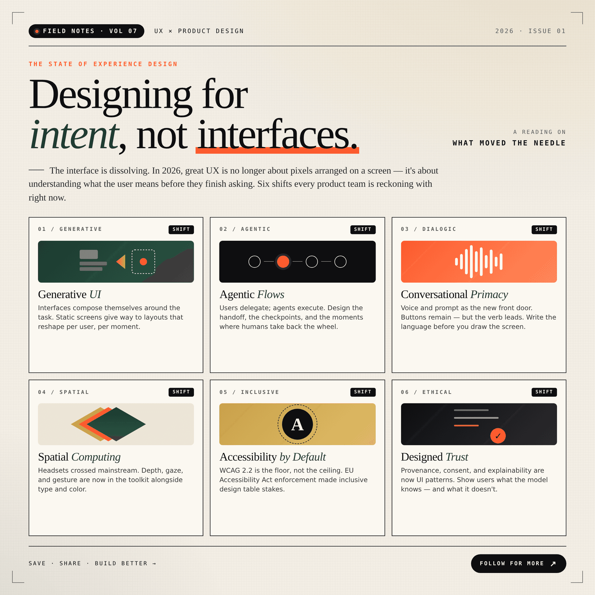
Then the same designer, in a completely different voice.
Glow by Rachel is a home salon in Kolkata — the stylist travels to you. The campaign runs across the monsoon and Durga Pujo, and it had a real job: fill five specific days in October, at named prices, with a phone number people would actually tap.
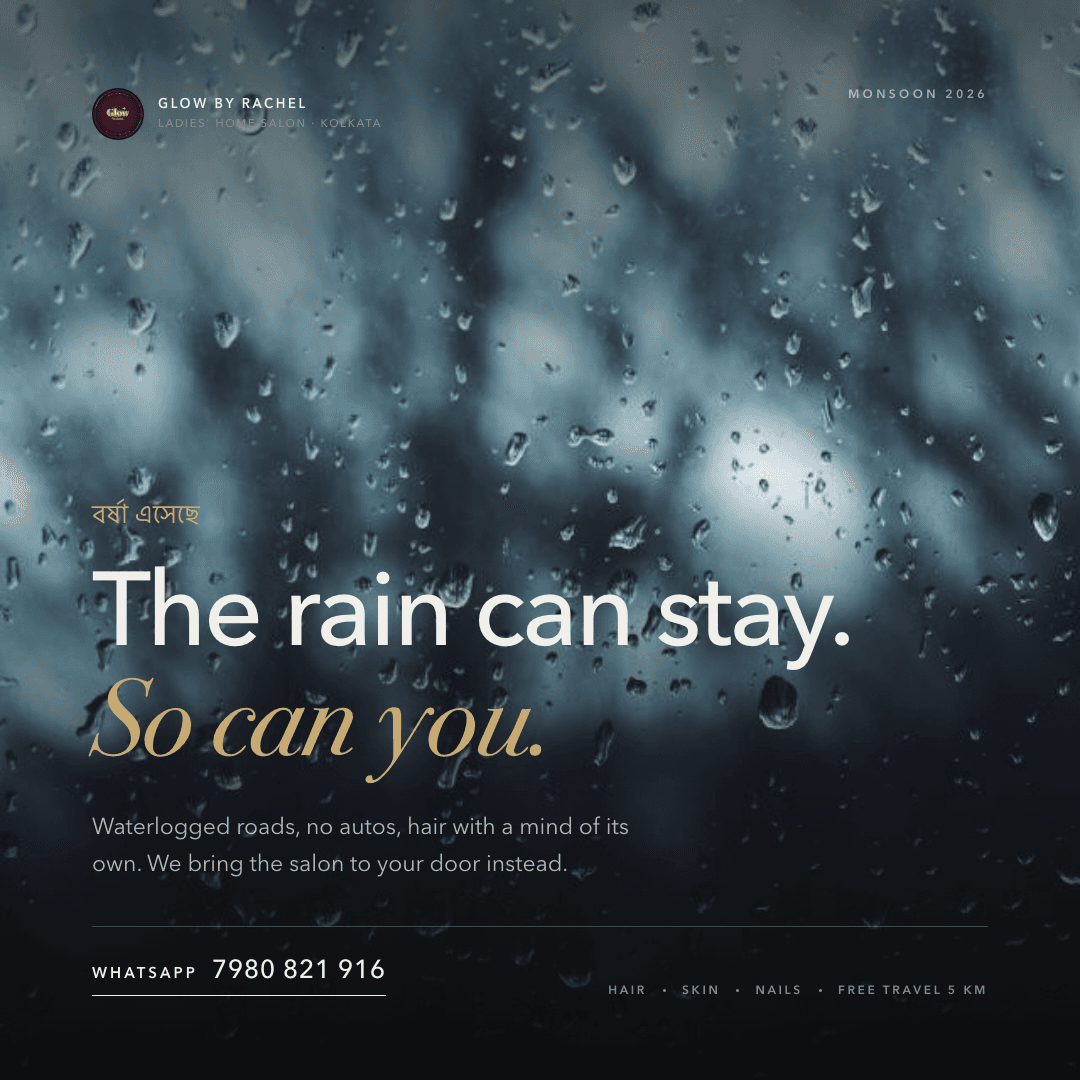

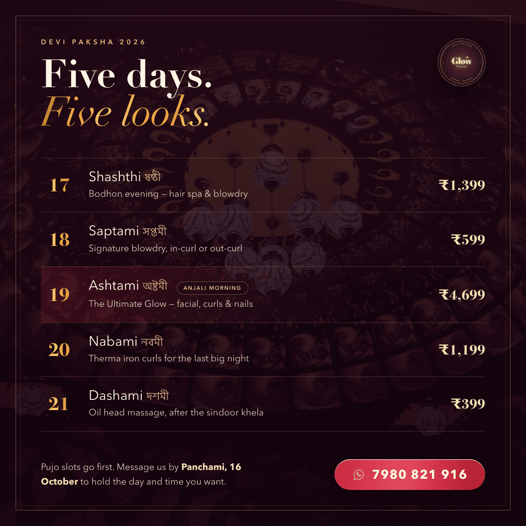

The Pujo pieces carry Bengali and English in the same lockup, and the two scripts do not share a baseline, an x-height or a comfortable weight range. Bengali's matra — the headline stroke along the top — gives the script a strong horizontal that Latin does not have, so a line that looks centred by metrics reads low by eye.
The fix was to stop centring them together. Bengali sets the register and sits above; English carries the offer and sits below, each optically aligned on its own terms, with the rule between them doing the joining. The day names run bilingually in the diary — ষষ্ঠী / Shashthi — because that is how they are actually said.
The editorial work is warm off-white, near-black type, one orange accent, a mono grid — a newsroom. The campaign is deep maroon and gold, a serif with real contrast, photography under a heavy scrim — a festival.
Blending them would have been easier and worse. A personal essay about design economics and an advertisement for a Dashami blow-dry are not the same speech act, and a house style that flattened them would have made both less believable. Holding two registers apart, and being disciplined about which one a piece belongs to, is the actual craft on display here.
The carousel's cover is a different deck's cover — it announces seven slides for a ten-slide argument, a leftover from an earlier cut that I shipped without catching. The campaign's rate card is at the outer limit of what a 1:1 square can hold; at 200px in a feed the prices are gone, and it should have been split into two posts. And the field notes are more readable saved than scrolled, which means they are quietly the wrong format for the place they were published.