A quick-commerce app for India, built as a direct answer to Zepto, Blinkit and Instamart with the fee stack, the cancellation traps and the refund runaround designed out. One fee, printed on every button. A clock that is a range the store can keep. Free cancellation until the bag is sealed. Twenty-five routes you can use on this page, in English and Hindi, light and dark, with the glass on or off.
A design prototype on fictional data. Zepto, Blinkit, Swiggy Instamart and the product brands shown are named for comparison and realism only; there is no affiliation, no real payment, no real map and no real delivery.
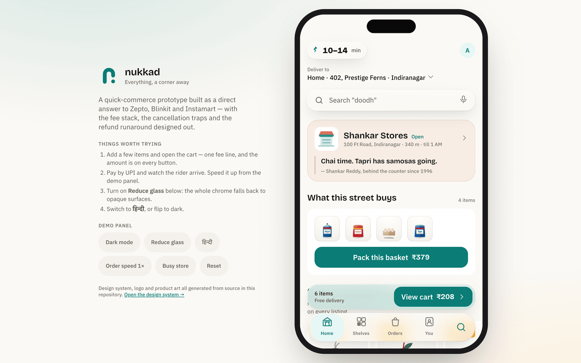
The real prototype, not a recording. It opens on the splash and walks you in: any four digits pass the code, and the demo panel beside the phone switches theme, language and glass. Runs entirely in your browser.The real prototype runs in your browser, but it needs a wider screen than this to be usable in-page.
Open the demo ↗Indian quick commerce solved the front half of the funnel and left the back half alone. The three incumbents sit at 4.4 to 4.7 stars in the app stores and 1.1 to 1.5 on the complaint sites, and that gap is the brief. Nukkad is built for everything that happens after the money leaves your account.
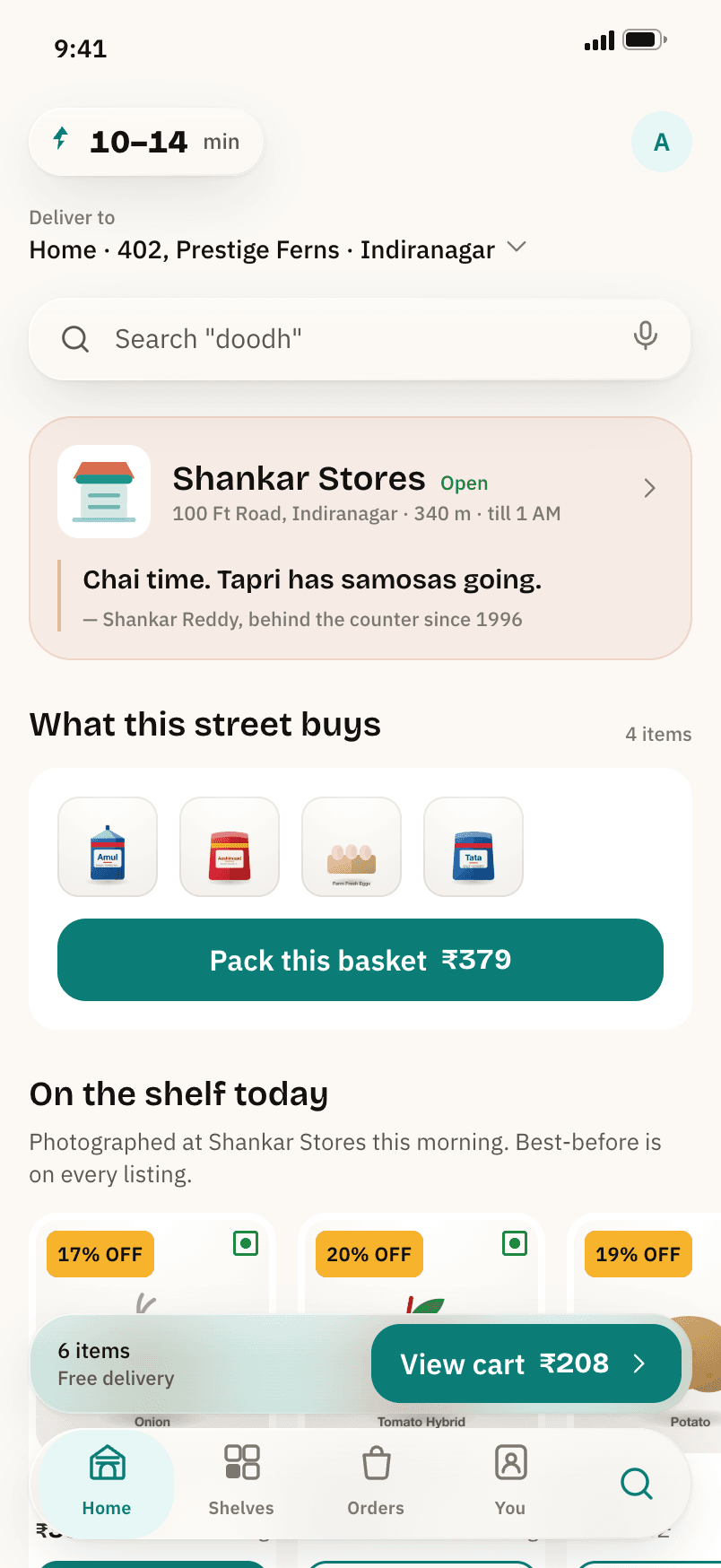
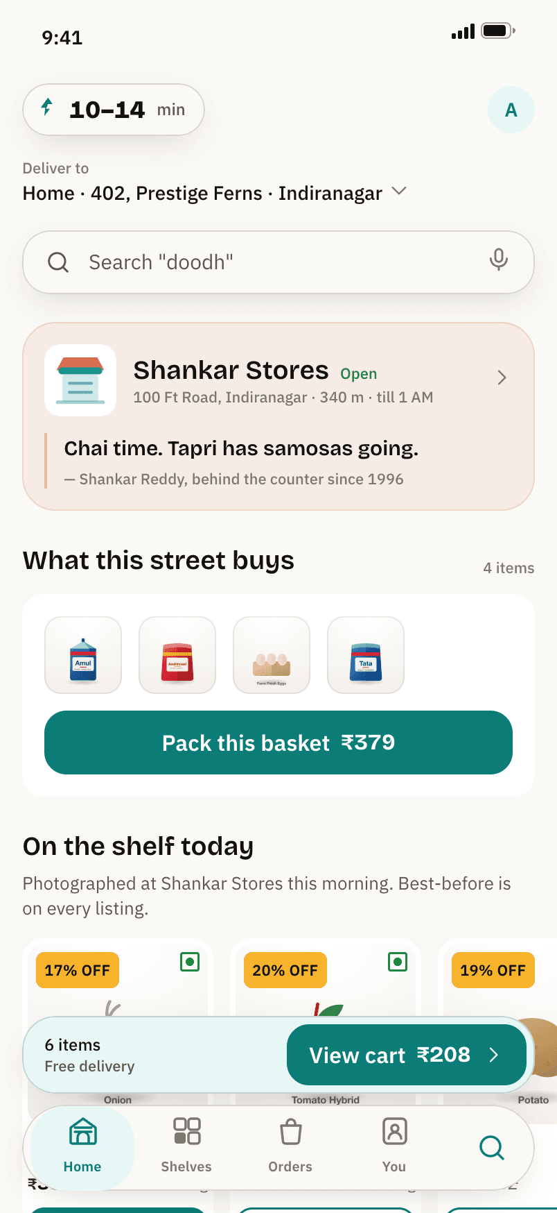
Launch it and you start where a first-time user starts: the mark on brand ground, three cards you can skip, a phone number, a code that fills itself, and an area chosen from a list that already shows how far away the store is. Then the home screen, which belongs to Shankar Stores on 100 Ft Road, Indiranagar, a shop with a person in it rather than a dark store with a number.
On a desktop the app sits in a handset beside a demo panel. The panel is not decoration: it flips the whole product to dark, to Hindi, or to opaque surfaces with the glass off, marks the store busy so you can watch the clock stretch while the price holds still, and speeds up the order simulation so a delivery takes seconds instead of minutes. On a phone the app fills the frame and is simply the app.
The specification this came from opens with the complaint clusters shared by all three incumbents, and none of them is about finding things. Refund friction leads at roughly forty percent: five-to-seven-day waits, wallet credit forced instead of cash, claims denied with the photo attached. Then missing items the rider insists were delivered, spoiled goods with no visible best-before, an ETA that says ten minutes against a forty-minute delivery and fires "arrived" from three hundred metres away, cancellation windows that close in seconds, and fee stacks that appear only at checkout.
Browsing, searching and adding to cart are excellent, and everything after the money leaves your account is not.
The fee stack is now a regulatory liability as well as a grievance. The consumer protection authority fined Zepto ₹7 lakh for drip pricing, a ₹170 item that cost ₹177.40 at checkout, and for pre-ticking a membership in the cart. A sub-₹99 basket carries about ₹54 in stacked fees on Blinkit and ₹55 on Instamart before any surge: delivery, small-cart, handling. Every one of those numbers is a design decision somebody made, so the product answers with three promises and builds each one into the interface where it cannot be quietly reversed.
There is exactly one fee: ₹30 on baskets under ₹99, free above it, and free at every size for members. No handling, platform, small-cart, rain, surge or late-night charge exists anywhere in the code, and the bill explainer lists the six of them by name under the heading What we will never add. When the store is slammed or it is pouring, the clock gets longer and the home screen says so. The price does not move.
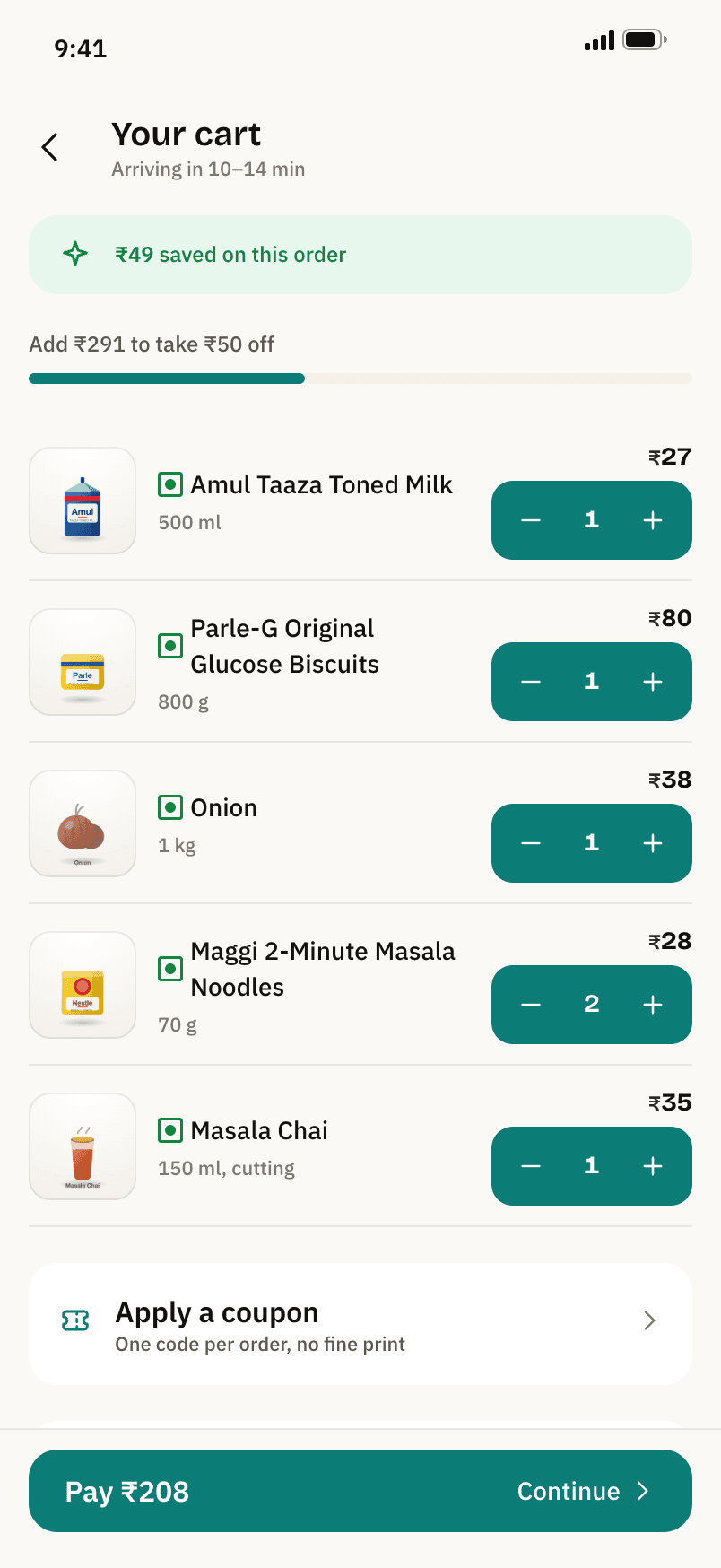
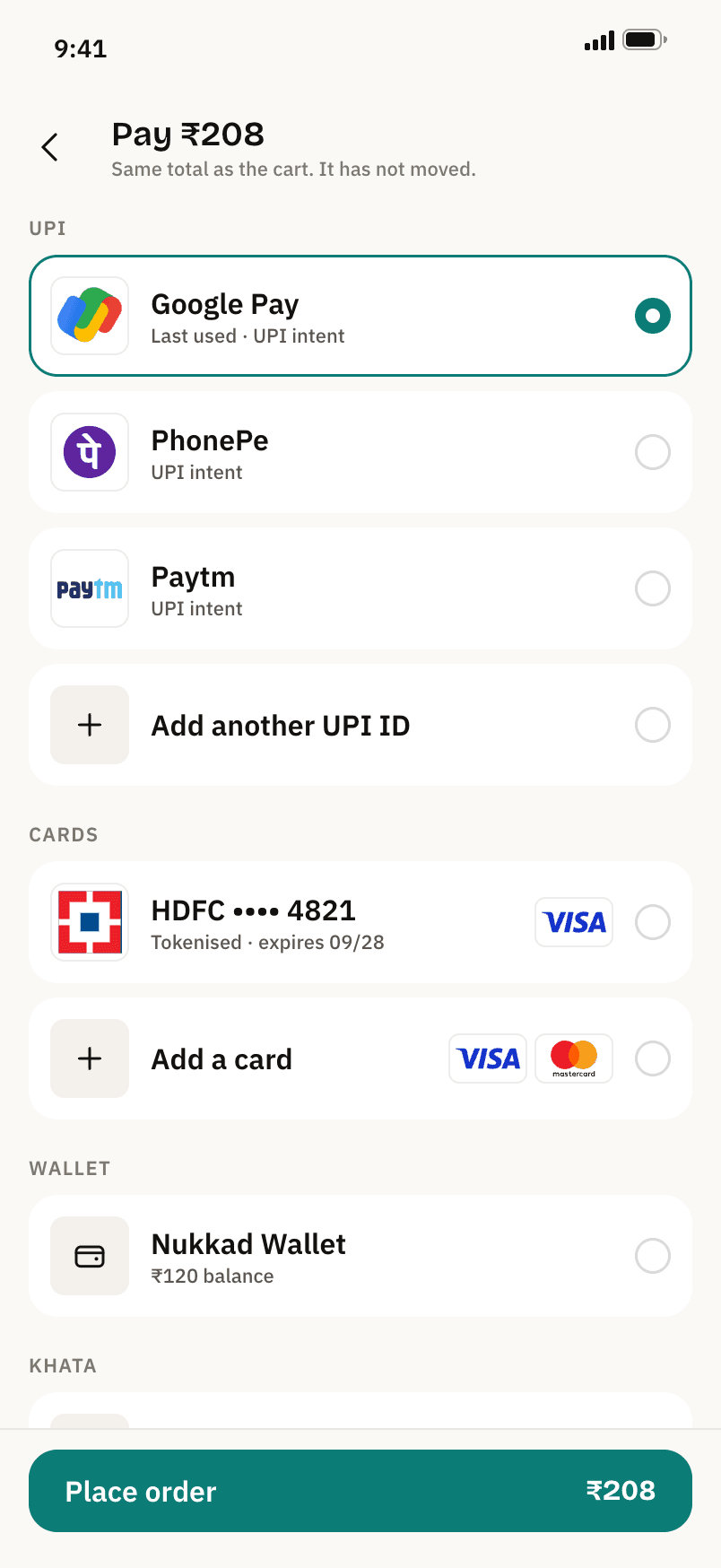
The structural version of the promise is quieter than the copy. Every surface that shows an amount, the cart bar, the cart footer, the checkout button and the payment button, reads from one function, so the number on the button is provably the number in the summary rather than a thing someone has to remember to keep in sync. The payment screen says it out loud: Pay ₹208. Same total as the cart. It has not moved.
Discounts follow the same rule. Basket tiers apply on their own, ₹50 off at ₹499 and ₹120 off at ₹999, with no code to enter and one progress bar toward the next unlock only. Tipping is opt-in, defaults to zero, and all of it goes to the rider. Prices are the same on every device and every account, which the bill explainer states as a commitment because the category has been caught charging iPhone users more.
The ETA is a range, never a single number, and never below eight minutes: ten to fourteen on a normal evening, twenty to twenty-five when the store is busy. After the December strikes and the Labour Ministry's intervention, the category itself stopped advertising ten minutes, so building a brand on a number the market has abandoned would have been a mistake as well as a lie.
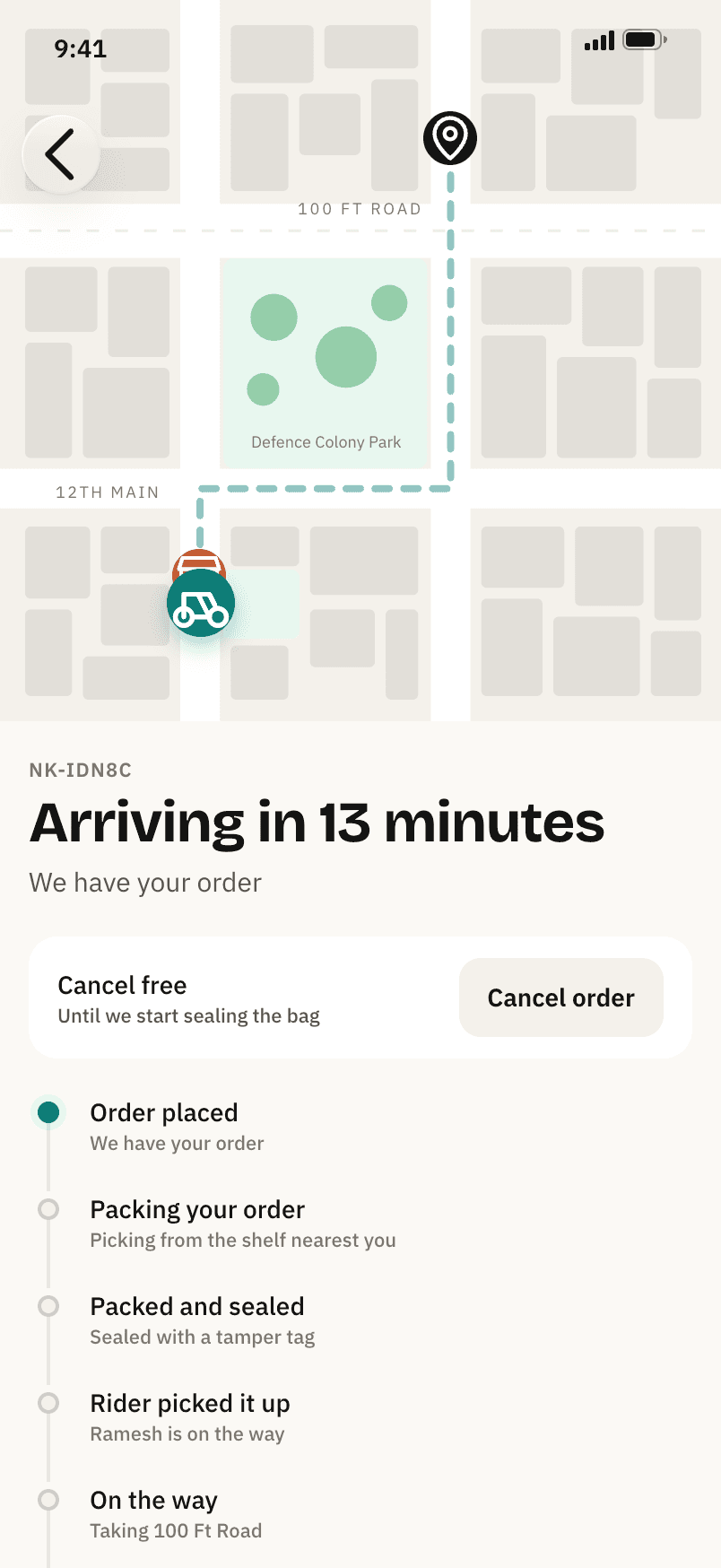
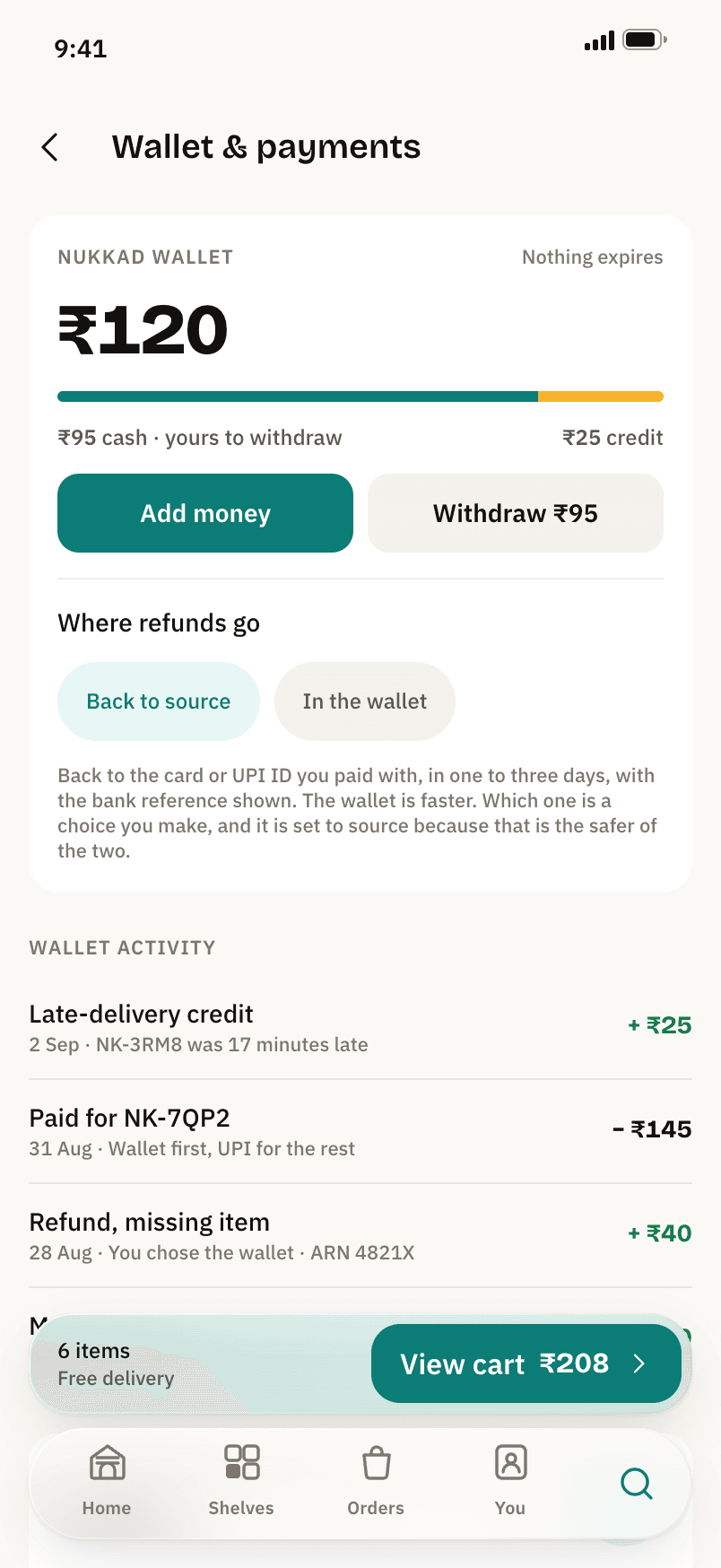
Two rules do most of the work. Cancellation is free until the bag is sealed, and the control says so for exactly as long as that is true; after sealing it becomes a two-tap support route with no fee. And a delivery more than fifteen minutes past the ETA shown at placement credits ₹25 to the wallet automatically. Nothing to claim, no form. The wallet screen carries the evidence as a ledger line: Late-delivery credit, NK-3RM8 was 17 minutes late, +₹25.
Refunds go to the way you paid, by default, with the bank reference shown in the app. Instant wallet credit is offered as an alternative and is never pre-selected. Missing or damaged items up to ₹200 are approved on the spot for accounts in good standing, with no photo required under ₹100, and the support sheet always exposes a route to a person with a callback inside ten minutes.
The same logic governs the membership. Nukkad Circle is one plan in three durations, never pre-selected in a cart, cancelled in one tap with benefits running to the end of the paid period, and it sends a renewal reminder three days ahead. If a member saves less in a period than they paid for it, the difference is credited. The incumbent was fined for the opposite of every clause in that rule.
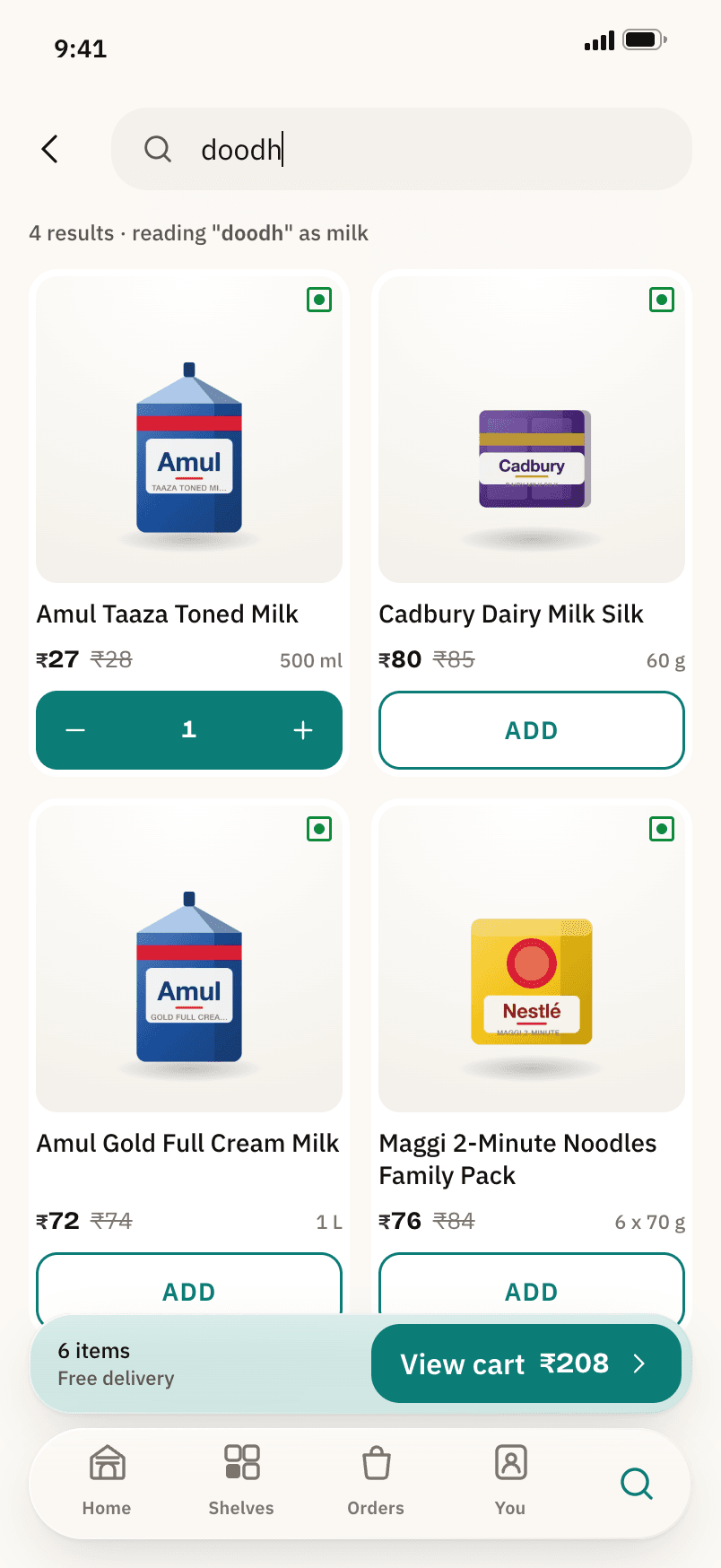
Nobody in Bengaluru types "milk". They type doodh, and a search box that returns nothing for it has failed at the first thing a grocery app is for. The query is expanded through a synonym table before matching, and the results say reading "doodh" as milk, so the translation is visible rather than magic and the person can correct it if the guess was wrong.
Most of the interesting decisions here are refusals, and the design system is most useful where it forbids things.
Genda means one thing
Marigold is the colour of money saved, everywhere in the app, and is never used as decoration. The savings banner, the unlock bar and the discount badges are the only places it appears, so the colour keeps its meaning instead of becoming a highlighter.
Glass belongs to the chrome
Liquid Glass is used for the dock, the cart bar, the ETA pill, the search field and sheet headers, and never for product cards, the bill, forms or long text. At most four glass surfaces exist on a screen at once, because compositing a blur is not free on a four-gigabyte phone.
Three tiers, and an off switch
Chromium gets real refraction, an SVG displacement map inside the backdrop filter that reads as light bending through a thick edge. Safari and Firefox get blur and saturation with the same tint and rim. Reduce Transparency gets an opaque surface with a hairline, and because most browsers never report that setting, the app ships its own Reduce glass control.
Nothing is pre-ticked
No membership in the cart, no tip by default, no notification category left on. The settings screen says it plainly: you get what is ticked here and nothing else, and there is no "important updates" category that quietly means marketing.
Numbers first, and they hold still
Copy leads with the figure: 9 min, ₹412, 6 items. The rupee sign is set at 85 percent so the number stays loudest, grouping is Indian, and every result, price and quantity is tabular, so a count going from 9 to 10 does not shift the row.
Float glass is clear when you look through it and glows green-teal at its cut edge, where the iron in it shows. Nukkad's brand colour is the material's own edge colour, which gives a Liquid Glass interface a reason to exist in the brand rather than a style applied over it. It also lands where nobody else is. Zepto owns violet, Blinkit yellow and green, Instamart orange, Zomato red, BigBasket lime, JioMart red: every saturated band on the wheel is taken except this one.
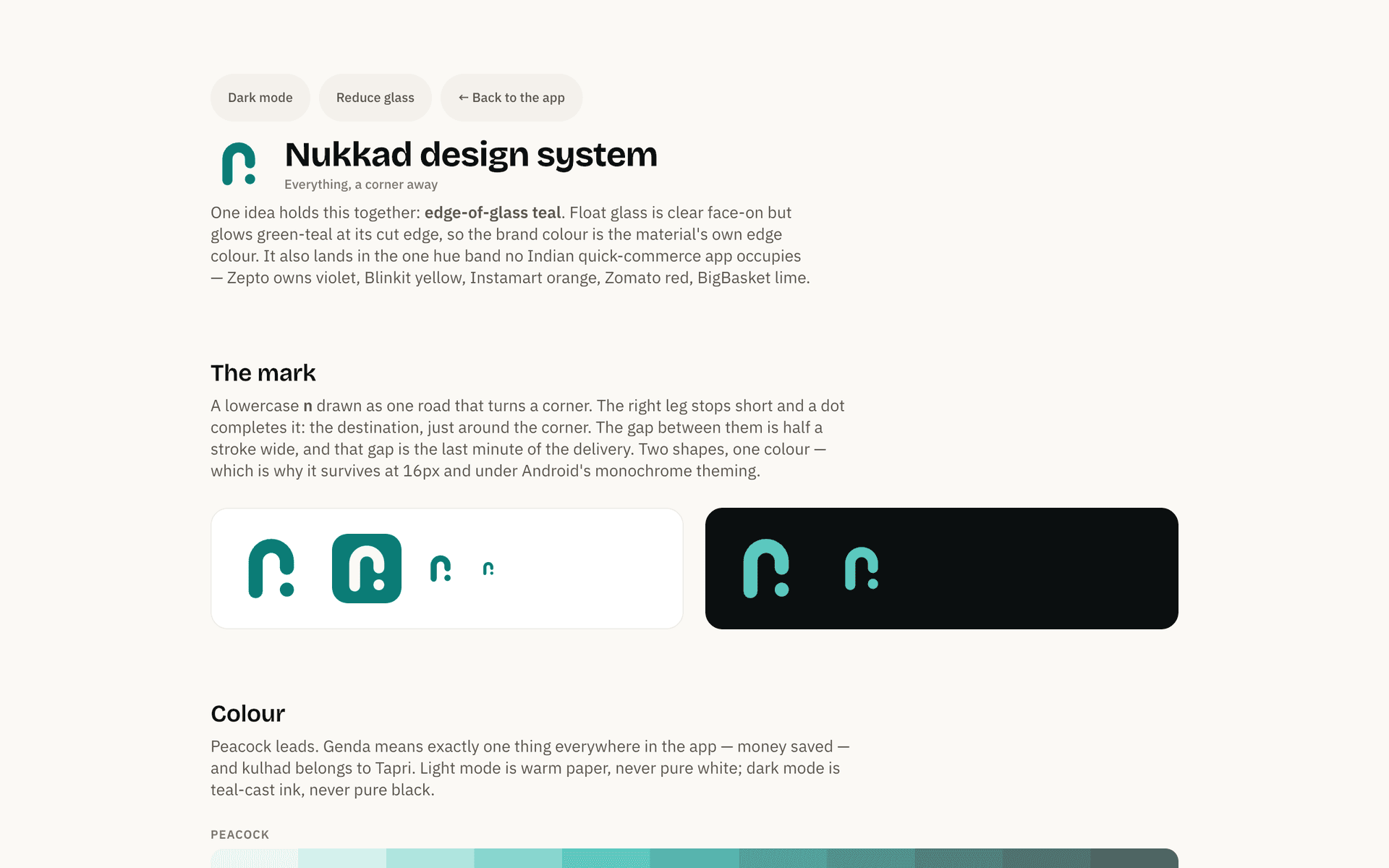
The mark is a lowercase n drawn as one road that turns a corner. The right leg stops short and a dot completes it, the destination just around the corner, and the gap between them is half a stroke wide: the last minute of the delivery. Two shapes, one colour, no effects, which is why it holds at sixteen pixels and under Android's monochrome theming. Two other directions were drawn and rejected, a rolling shutter that compressed into a battery at small sizes and four blocks around a crossroads that read as a generic apps glyph. Both are kept in the system next to the comparison harness that decided between them.
The rest of the identity follows the same discipline. Five palettes with one-word names: peacock, kulhad for the terracotta of a clay chai cup, genda, paper and ink. Three gradients exist in the entire system and none of them is allowed on text, a button or a page background. Type is Bricolage Grotesque for headlines and prices, chosen for numerals with enough weight to carry the brand, IBM Plex Sans for the interface, and matched Devanagari faces for Hindi so a bilingual line is a design rather than a fallback. Radii are concentric and never guessed: an inner radius is the outer radius minus the padding between them.
Dark mode, Hindi and Reduce glass all switch live, from the settings screen inside the app or from the demo panel beside it. Dark is teal-cast ink rather than pure black, light is warm paper rather than pure white, and contrast is measured against the worst-case backdrop behind a glass surface rather than the average one. Hindi does not just translate the strings: it swaps the typeface, keeps product names in English with Hindi aliases, and lets the shopkeeper's one line on the home screen speak in his own language.
The argument in four screens: the bill, the clock, where the money goes when something goes wrong, and the total that never moves.
One fee line, expanded by default. ₹208 on the button.
A range, not a countdown. Cancel free until the bag is sealed.
Refunds go back to source, with the bank reference shown.
Pay ₹208. The same total as the cart, and it has not moved.
Under three minutes to a first order, the same shape as the incumbents, with the dark patterns left out.
The mark on brand ground. Made for India.
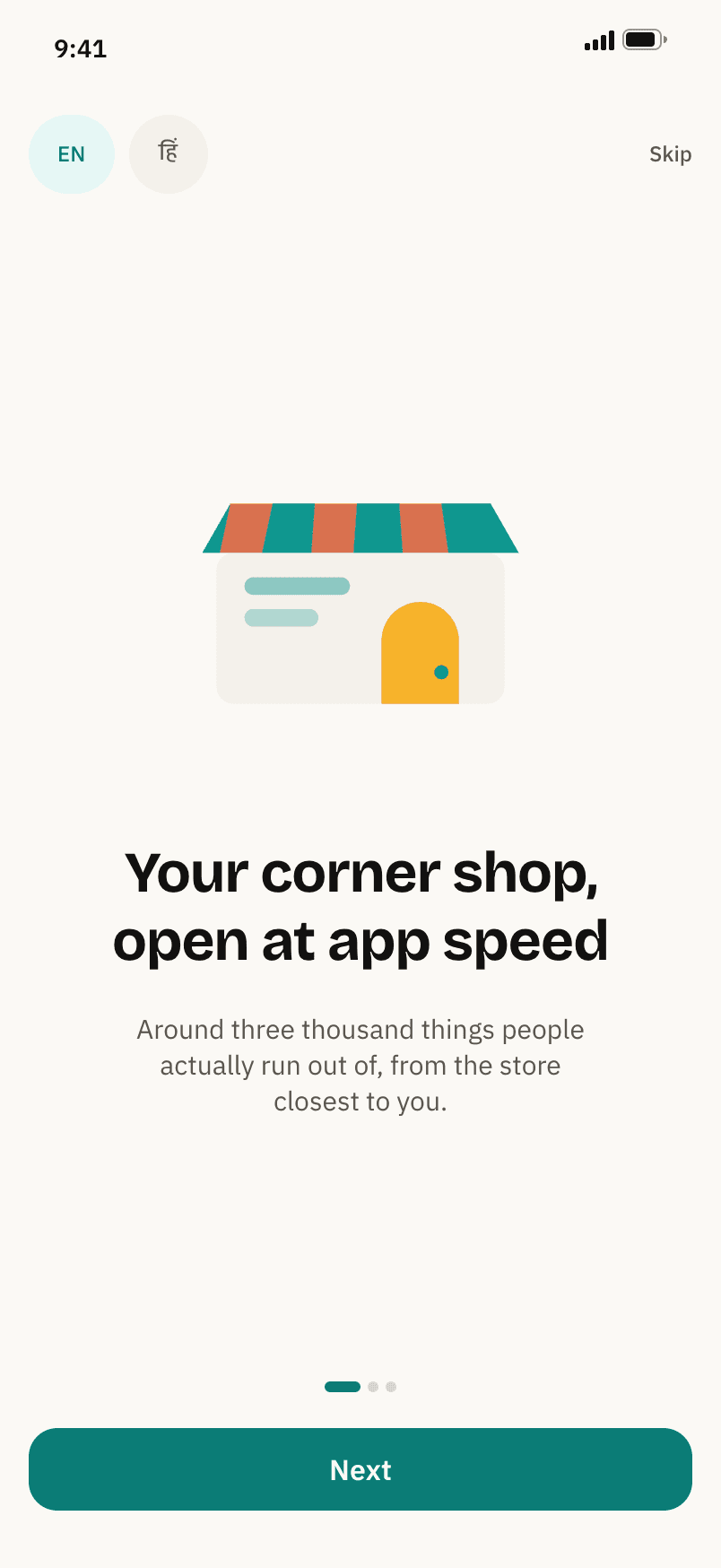
Three cards, all skippable. Language chips from the first screen.
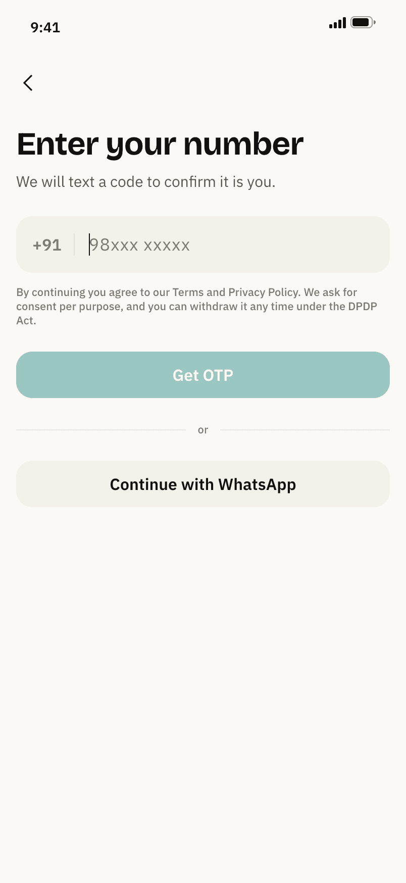
Fixed +91, consent per purpose, WhatsApp as the fallback.
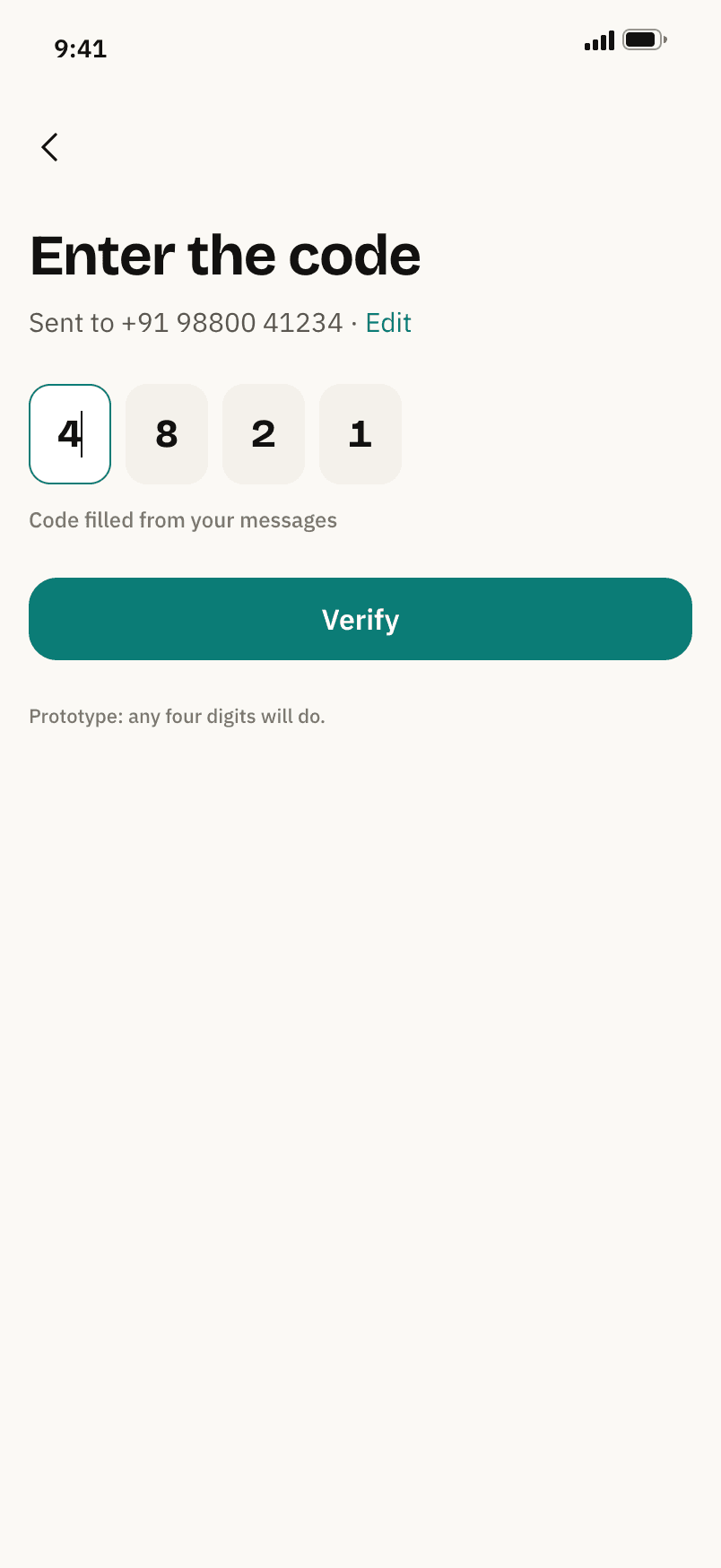
Four boxes, filled from the message. Any four digits in the prototype.
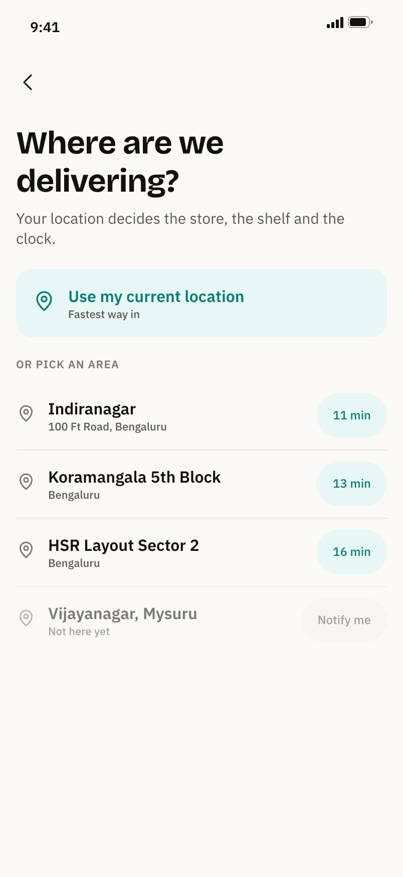
Areas carry live ETA badges. Out of range offers Notify me.
The corner shop's shelf, with the shopkeeper still in it.
The ETA pill, Shankar Stores, what this street buys, today's shelf.
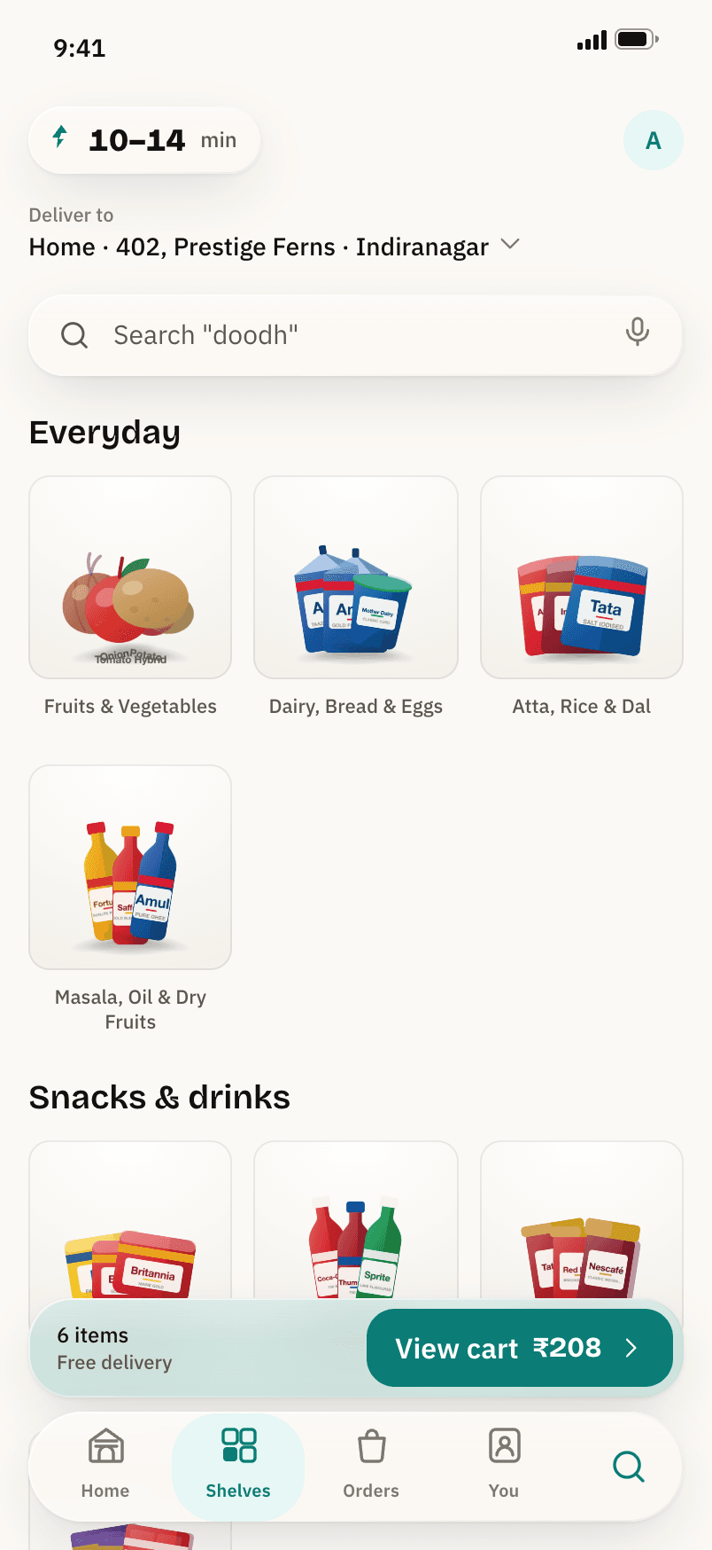
Shelves grouped by how a household runs out of things.
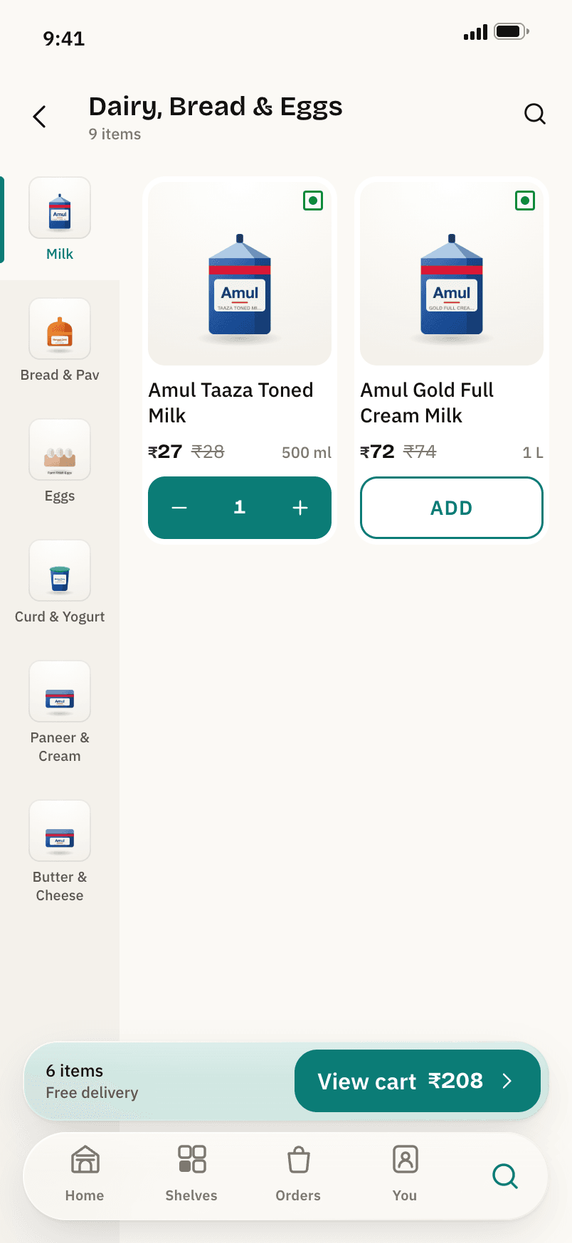
A sticky sub-shelf rail. Sold-out sinks to the bottom.
Four results, reading doodh as milk. The translation is visible.
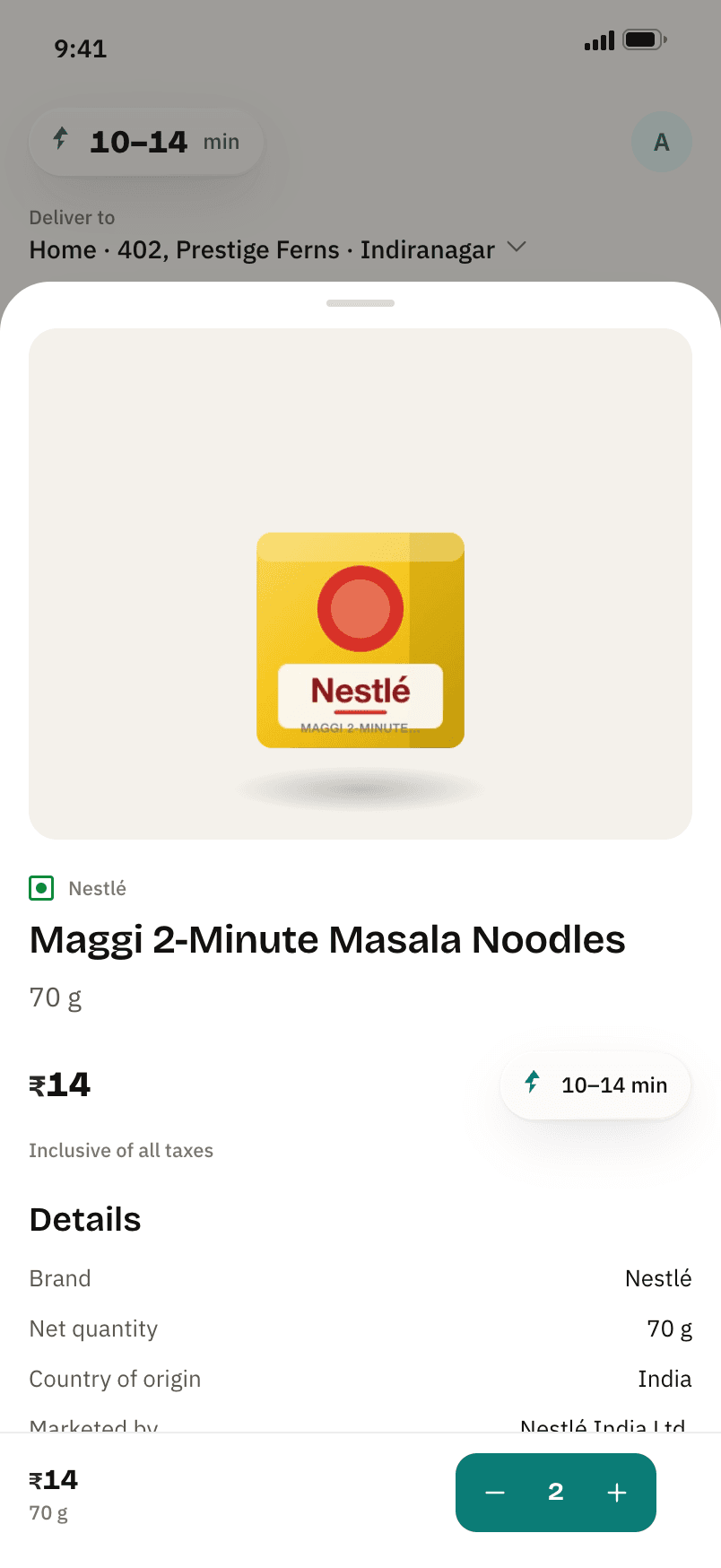
Legal Metrology on every listing: net quantity, origin, marketer.
Nothing is added after the cart, and the order is placed by an explicit tap.
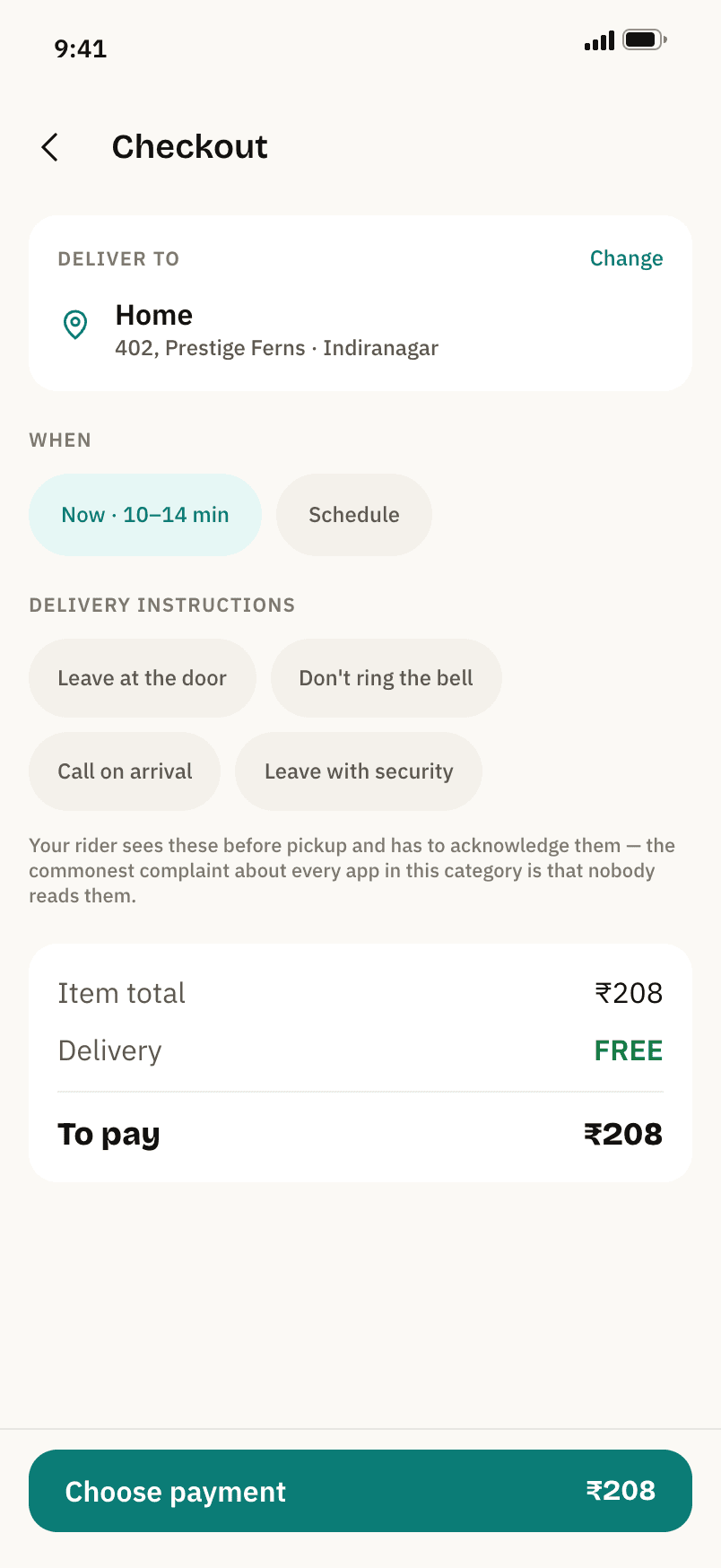
Delivery instructions the rider has to acknowledge before pickup.
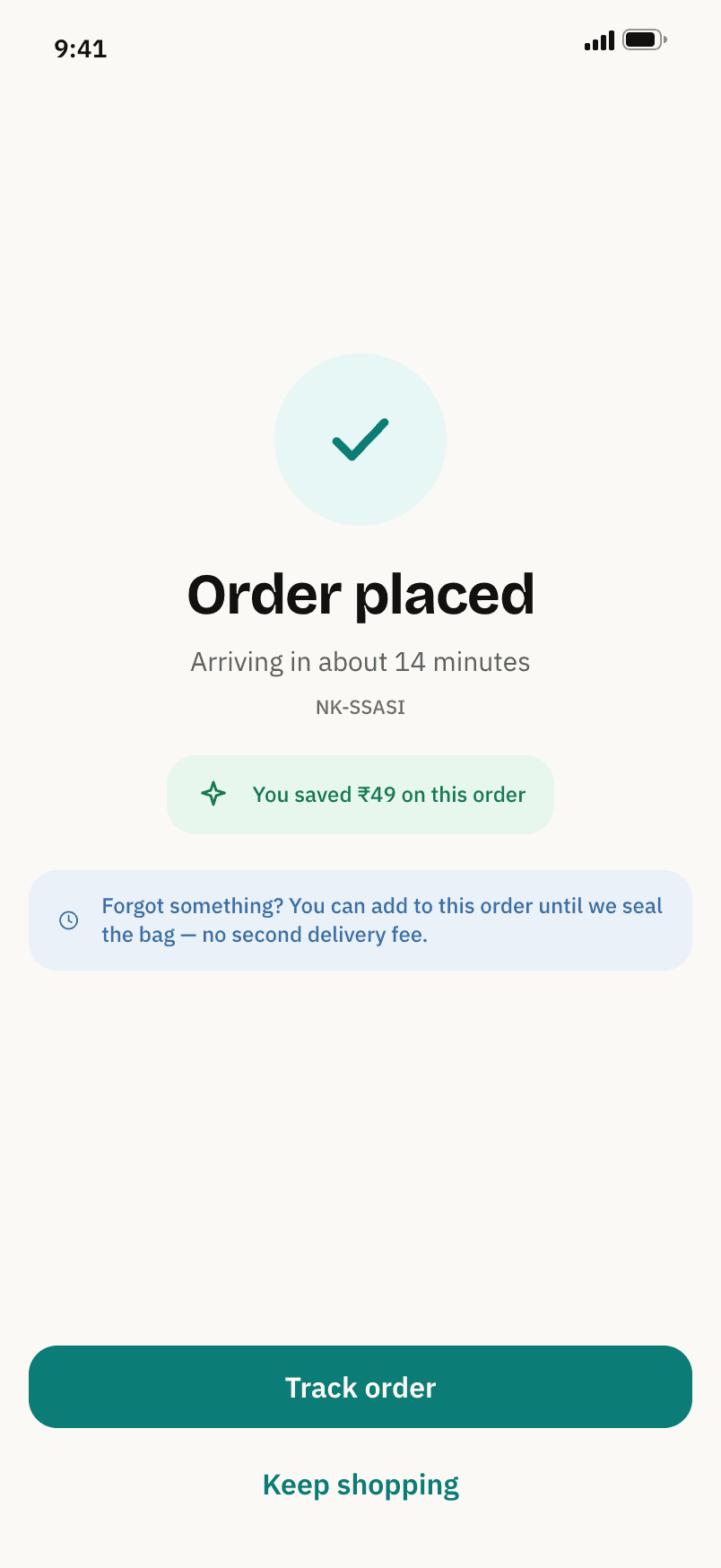
Order placed. Add to it until the bag is sealed, with no second fee.
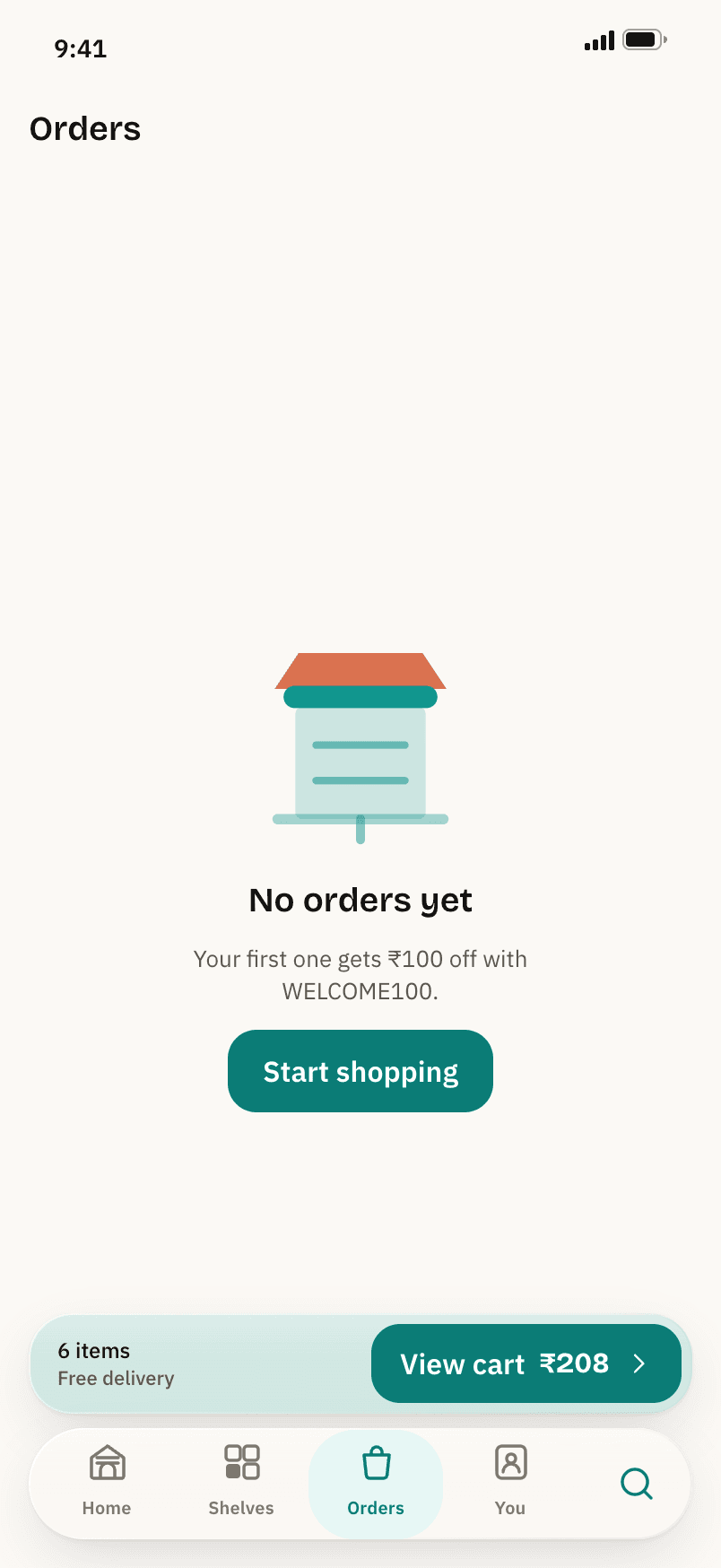
An empty state with a job: the first-order code lives here.
Membership that is never pre-ticked, and settings that mean what they say.
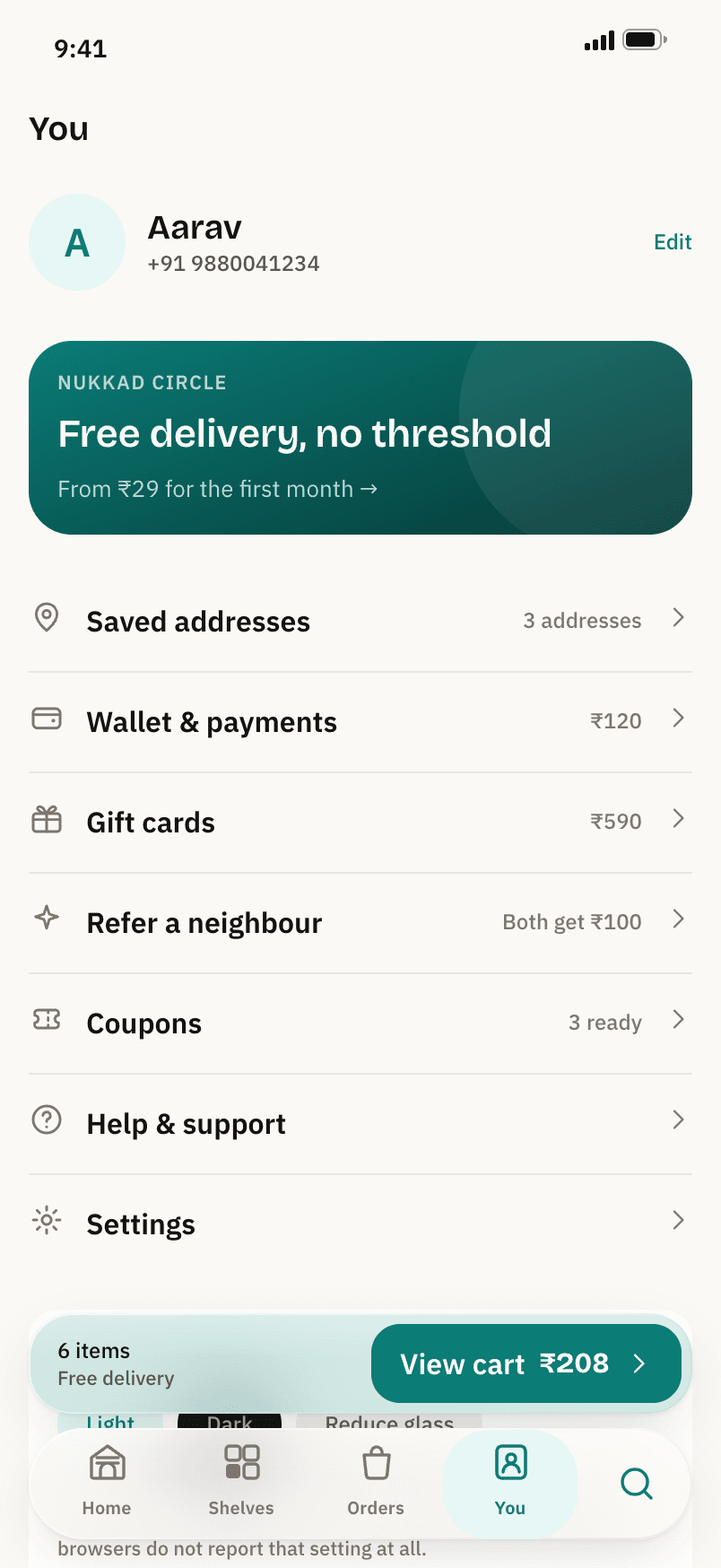
The Circle card, addresses, wallet, gift cards, a neighbour referral.
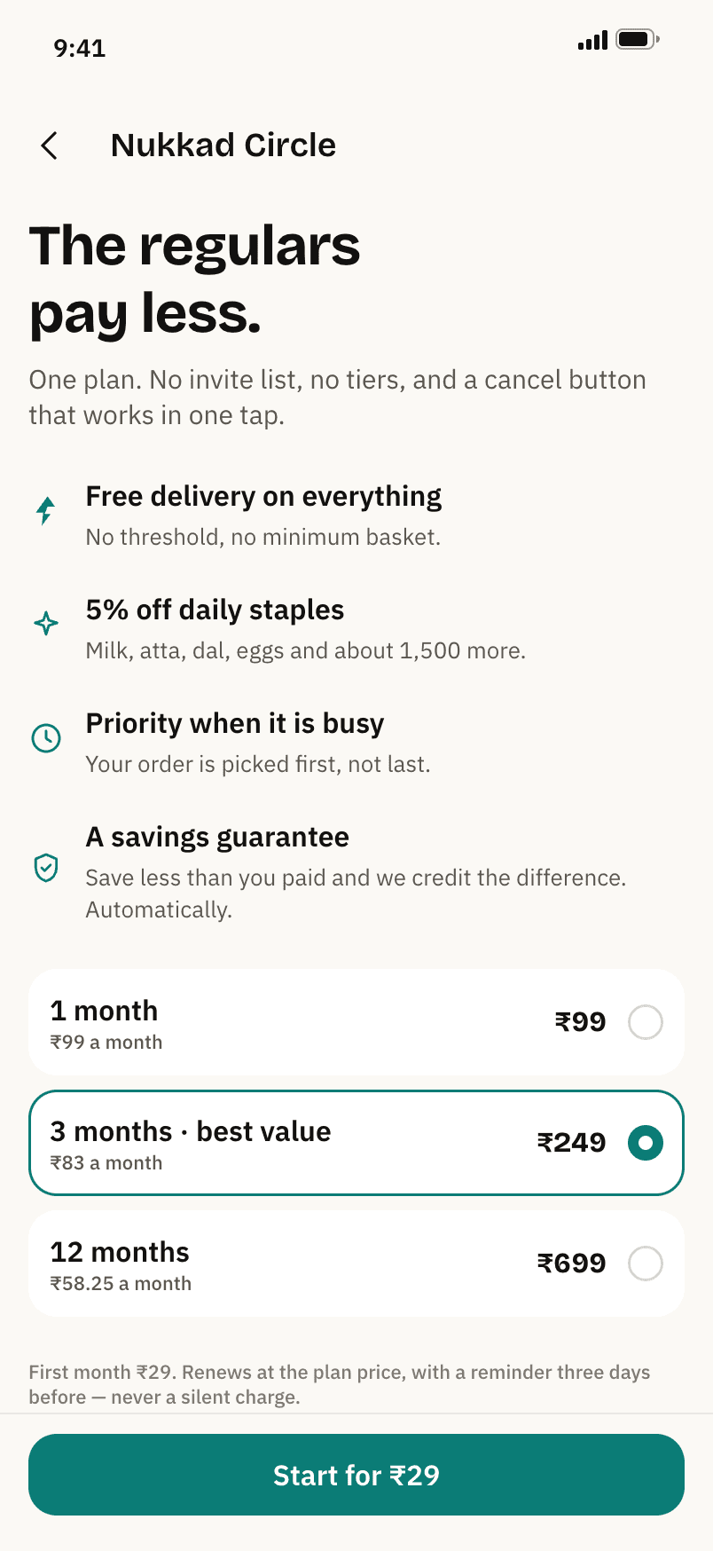
One plan, three durations. First month ₹29, a reminder three days before.
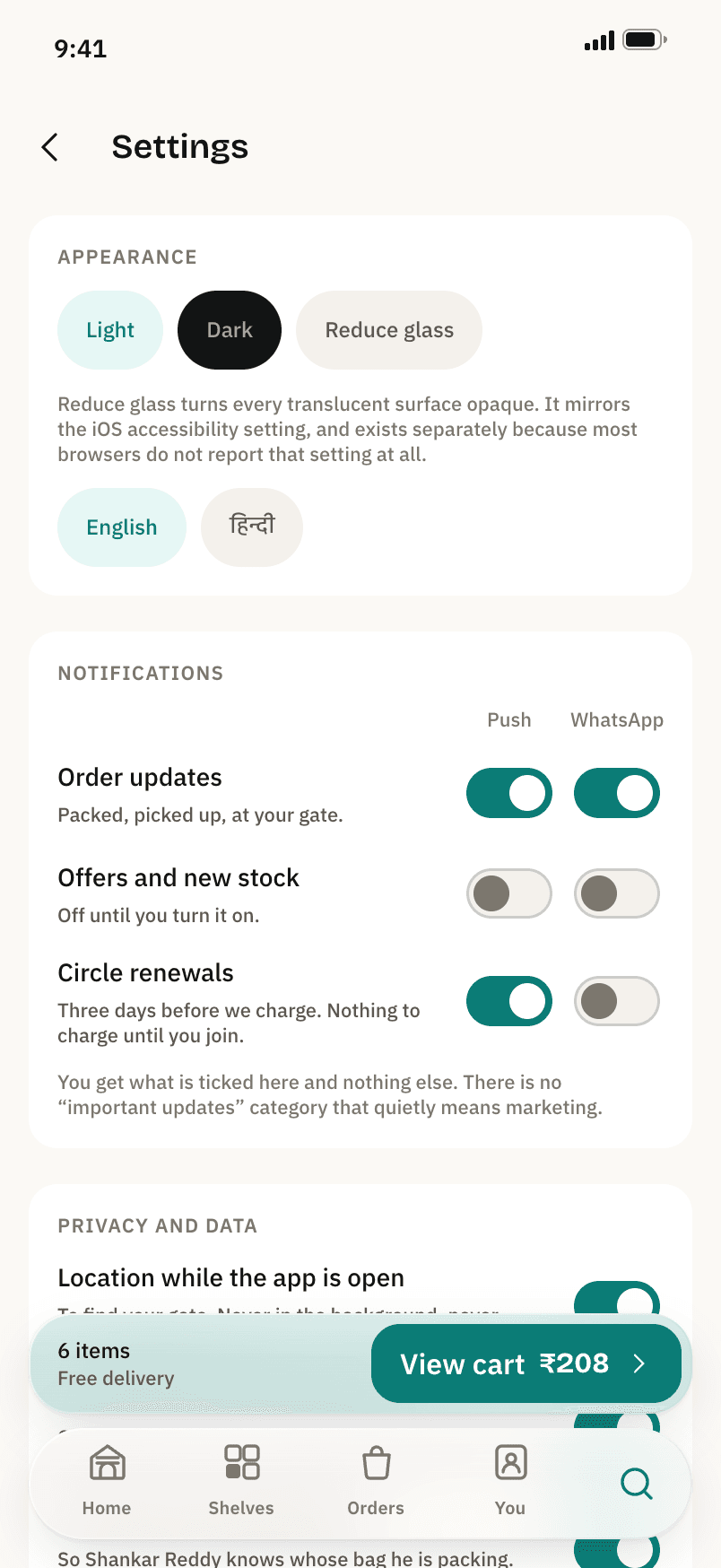
Reduce glass, Hindi, and no notification category that quietly means marketing.
Dark, Hindi and Reduce glass switch live. Hindi swaps the typeface rather than hoping a fallback picks it up.
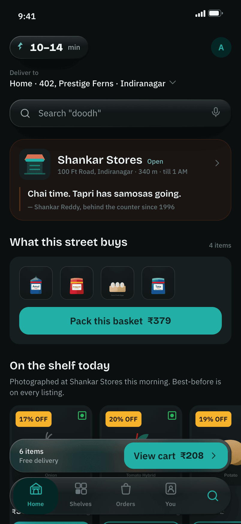
Ink: teal-cast dark neutrals, never pure black.
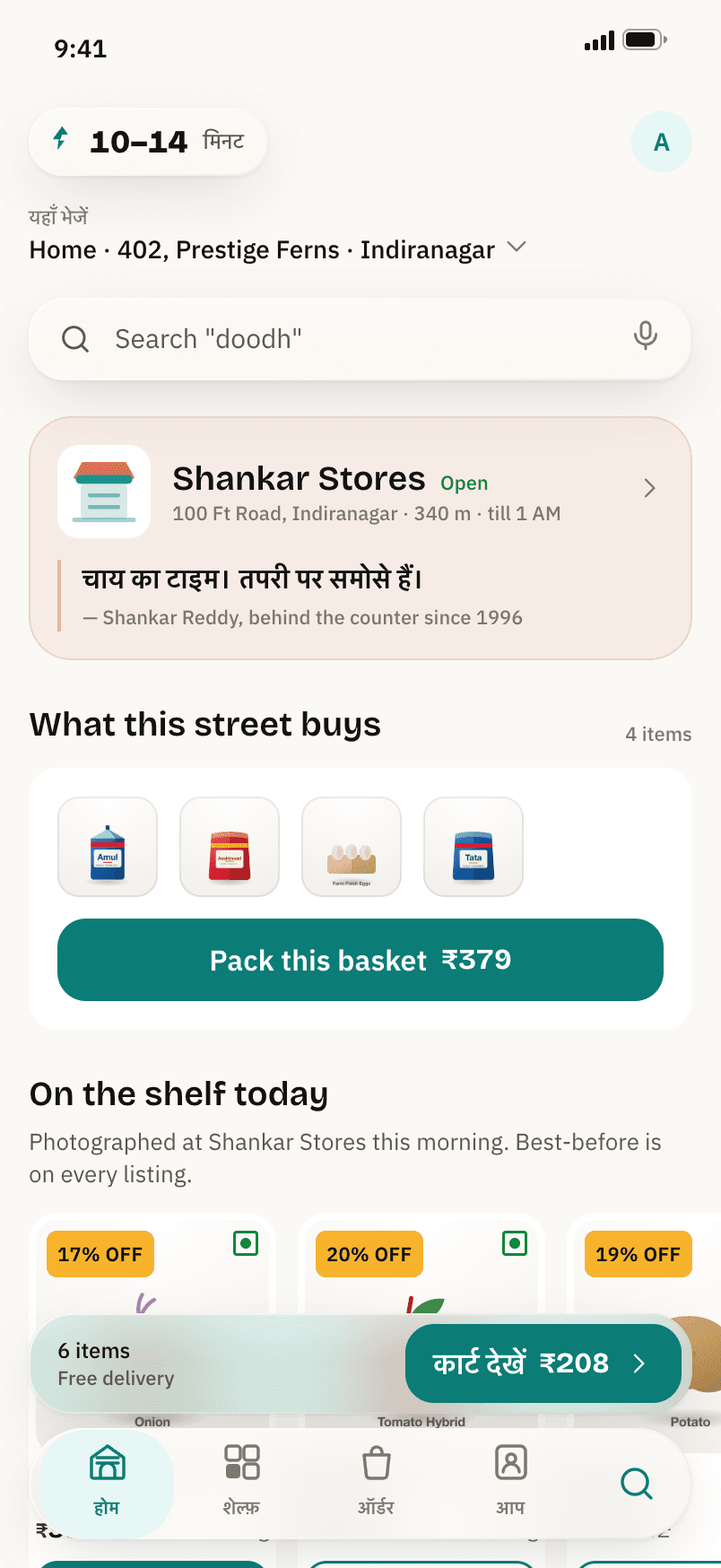
Hindi throughout, set in Plex Sans Devanagari and Anek.
Reduce glass: every translucent surface turns opaque.
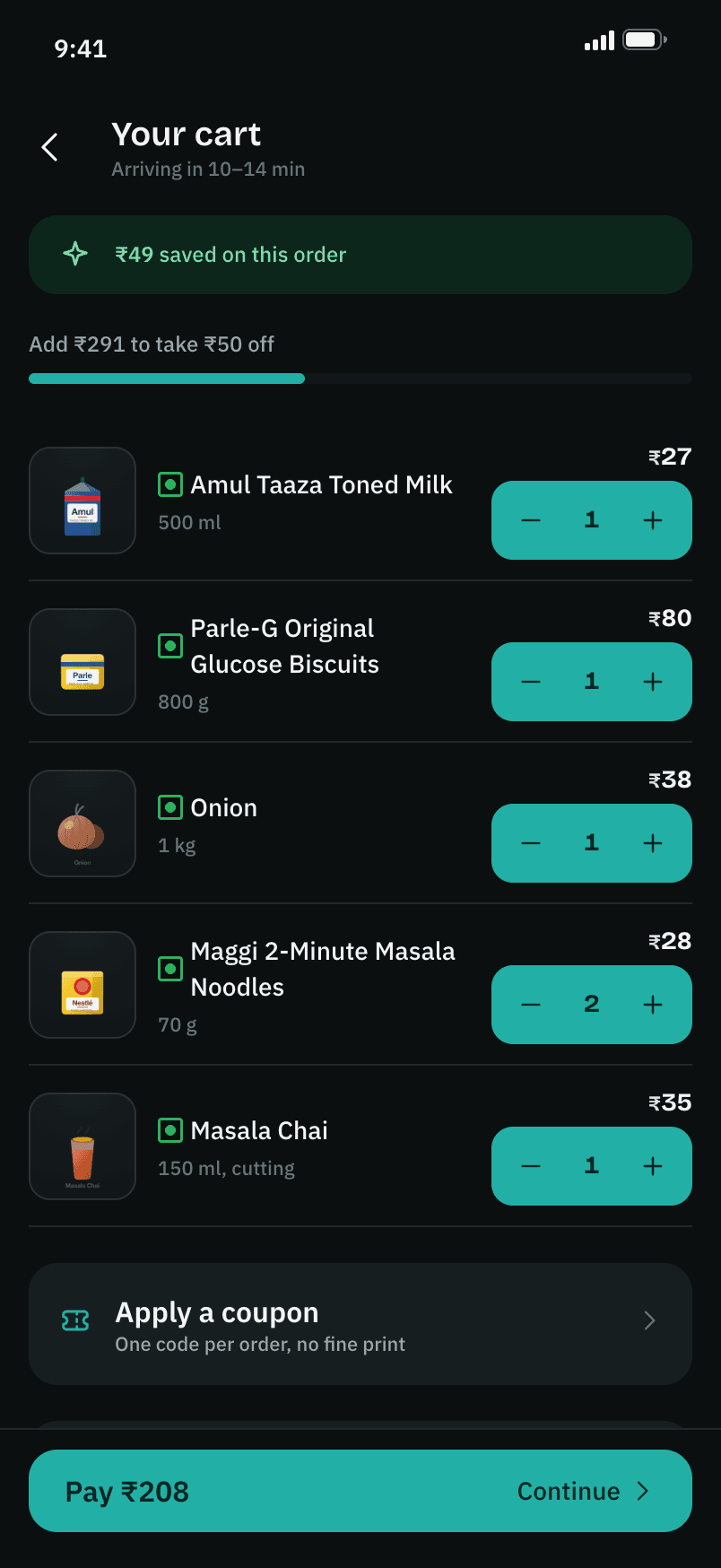
The bill in the dark, tabular figures throughout.
What the build settles is the thing a deck could not: that the fee model, the clock and the refund rules are coherent from the first cart render to the wallet ledger, with one computation feeding every number the customer sees. Adding an item, cancelling inside the window, running the store busy, switching to Hindi mid-order, all of it holds together because the rules live in one place and the interface reads from it.
What it cannot settle is everything the prototype pretends to talk to. Serviceability at scale, the picker and rider surfaces, real inventory reservations and a payments integration are described in the architecture rather than built, and that is where the next fortnight of this project would go: the rider app, so a delivery instruction the customer typed is something a rider is made to acknowledge rather than something that gets read.
 Praduan Saha